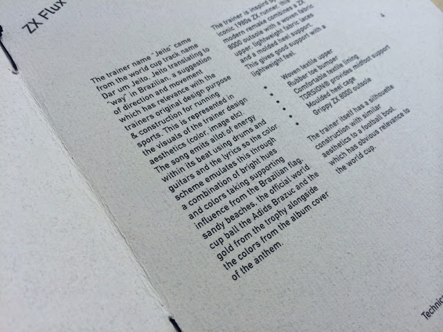
OUGD401
Context of Practice Chronologies, Contexts and Analysis
essay
Choosing a particular period from 1800 to the present, in
what ways has art or design responded to the changing social and cultural
forces of that period. (2 specific related examples)
I have chosen to review the period of the 1980’s too this
present day within the new millennium and how hip-hop music and the
urban/street scene has influenced fashion design and culture, along with
graphic design behind the promotions off these said fashion brands. The sports
wear manufacturer Nike will be the main focus within this said urban/music
influenced fashion category and how everything has also fully recycled to this date.
What I mean by this is that fashion, cultural and social influences have turned
full circle and become as popular in this age as they were in their origins
back in the 1980s. By reviewing and analyzing examples off Graphic Design and
Shoe design from the 90’s and present I can review the connotations and
elements that derive from urban/street and hip-hop influences.
There were many cultural elements that were considered when
designing these said fashion and graphic design examples. Ranging from footwear
and their links with sports that it is used in to promote the item to how music
has influenced designers off art & design and fashion alike. Nike-justdoit.weebly’s
mentions that (2011) “The two main
drivers of this huge culture include basketball and hip hop.” (Nike-justdoit.weebly’s,
2011) This statement provides
sufficient support on my opinion on how hip-hop and urban/street culture
influenced fashion an design alike.
Social influences are also as strong as these cultural
categories that influenced fashion and graphic design so looking into different
social groups will give me insight into how they provided effect on fashion
design and graphic design alike.
To begin with I will discuss the rise off hip-hop culture in
the late 1970s into the 1980s, in the South Bronx area in New York. Over the
decades there has been many subcategory’s within the whole hip-hop umbrella,
the introduction off new school hip-hop and golden age hip-hop paved a way for
the separation of the east and west coast with rival rappers creating the
culturally known gangsta rap era. (Rapworld.com
2010)
By the 1990’s there were two main rappers who were known in
the cultural circle off hip-hop as pioneers, Biggie smalls representing the
East coast and Tupac representing the West coast. Both proved to be huge
fashion icons like the likes off Pharell and Kanye West are today. Pharell
creating his own urban influenced clothing brand called Billionaire boys club
and Kanye West endorsed Nike and currently endorses Adidas. Biggie small
especially has created a full circle influence on fashion with a pair of Nike
Dunks been released earlier this year inspired by a jumper biggie smalls was
photographed in during his hay day. This created the birth for integration
between sportswear brands and hip-hop music creating what I feel was the birth
of Urban and street culture. (Rapworld.com 2010)
While having obvious influences from the jumper worn by
Biggie the colors used to me connote retro elements, as I mentioned the element
of recycling the 80/90s into the modern era this strengthens that concept.
Bright vibrant retro colors that remind me off the 90s brought into a modern
day production of a fashion item. The actual construction off the shoe is based
on a retro shoe design created for the basketball scene, the high top creating great
support for the strain the ankle goes through during the game of basketball.
This design off shoe the “dunk” along side the “air max” created a duo one of
the most iconic shapes off the 90s that are gaining ever more in popularity to
this date. SNEAKERBARDETROIT (2013)
I also learned that like Pharell Biggie smalls released a
clothing line not long after his spout off success. (BROWN. 2004) informs me
from an interview in 1994 that Biggie quotes “I got some shit comin’ this year, no doubt I got my own clothing line
line called Big Man Clothes” (BROWN. 2004. p.73). Rappers adding there
stamp to the fashion industry was as ripe then as it is now.
[Fig 1.]
I will now provide a brief history off the Nike air max from
past to present with the information and imagery provided by SABOTAGETIMES
(2013). Alongside this I will tie in my own personal feelings and links with
hip-hop and urban culture within the development off the ever-famous Air Max.
In 1979 Nike introduced air cushioning technology by integrating
air bubbles in the midsoles of running shoes, It benefits the likes of Athletes
in the basketball sector all the way too the urban inspired sport of
skateboarding.
Eight years later, this cushioning became the main visual
off the iconic Air Max.
Image provided by SNEAKERNEWS (2012).
[Fig 2.]
From this design came the design that has turned full circle
and is as popular today as it was back on its release date in 1990 designed by
Tinker Hatfield, the construction off the midsole separated into front and back
compartments allowed the selection of performance enhancing materials for the
sportswear market while giving off aggressive aesthetics that the urban street
wear scene thrived off and an instant classic was born.
This classic use of the “infra red” color scheme was used in
the original Air max III back in the 1990’s and released in that exact same
iconic scheme under the new label Air max 90 in 2000. This backs up my initial
thoughts off Nikes use off retro high impact colors used in the Biggie smalls
dunks analyzed earlier, this strengthens the idea that hip hop has influenced
the sportswear giants Nike and how its recycled and done a full 360 from the
fashions back then to the fashions we see now.
[Fig 3.]
This iconic air max shape gave hip-hop artists opportunity
to put there stamp onto an already established piece off history within the
fashion industry bellow is a design created by Dizzie Rascall in 2009 they were
named Tongue & Cheek and released on promotion off his best hit album and
gained huge popularity with the worlds “sneaker heads” fetching huge price tags
for collectors. This proved to Nike that there were huge profits to be made by
incorporating hip-hop artists into their product development and from 2009
onwards collaborations became a main focus with the music industry and other creative
to keep with the current trends and inspire fresh ideas.
[Fig 4.]
A graphic design company I admire “I love dust” collaborated
with Nike producing camouflage patterned trainers that met the current camouflage
trend within the urban scene around mid 2013. They produced beautiful
advertising campaigns and illustrations to promote there range off footwear
collaborations. The color schemes used here consist off a monochrome scheme
with different tonal ranges off grey with highlighting elements off pastel
green included too add depth and impact to the design. The use of a camouflage
pattern has definite connotations with urban culture as mentioned due too the
colors and what they denote to me. The idea of asphalt been a main aspect derived
from the streets is connoted in this design through the use of a cool grey
color in varying tones, with the odd element off green added into the
camouflage pattern to represent the sparse amount off greenery found in urban
city scenery.
[Fig 5.]

This collaboration with graphic design company’s used to
promote and enhance Nikes sports wear ranges personally derived from a design
created by Neville Brody in the 90s. It played on Nikes globally accepted
slogan off the time “just do it” and added motion too it creating an
advertising campaign called “just bounce it”. Aesthetically I don’t really like
this design but its connotations off the product its promoting are very clever.
To begin this analysis I just want to point out the obvious design style
differences that Nike have chosen the 2 different designers to use too
communicate their product. I Love Dusts design communicates simplicity in its
layout with intricacy within the details off the illustration all confined into
the image off the trainer itself and a similar style backdrop for the image to
sit on. Neville Brodies digital design is busy and loud from the outset, but
the elements that create this busy and random layout composition are simplistic
in there selves with a basic sans serif typeface (Helvetica) used in a variety
of weights, sizes and orientations used to create a sense off movement. This
sense off movement to me denotes the motion off a basketball which is what the
shoe is designed to be used for. The use off overlapping type and colored
elements create impact on certain elements causing a visual onomatopoeia off the
word “bounce”, its also an interesting way off using a Hierarchy in a more
abstract way bouncing the viewers eye around the design.
Another interesting concept that fits around the idea off
the recycling off fashions from the 80/90s to now is the use off different
design techniques. The use off red within the design adds an element off
contrast to the whole tonal range off the piece turning a quite monochrome
color scheme into something with a little more impact.
The fact that I love dusts modern branding off Nikes work
uses a lot of hand drawn elements and Neville’s is entirely digital is
presenting the rebirth off traditional techniques been used in Art & Design
which is something I feel strongly about and follows suite and links with the
idea off fashion and cultural elements recycling to the modern day.
The use off the African American person in the design to me
represents the cultural acceptance off hip-hop, basketball and street sport
culture been directly linked to the black youths off Brooklyn in New York. This
common connotation comes from N.Kleine (1999) writings into Nikes “corporate multiculturalism” (KLIEINE,
1999) branding focus on Black American youths and basically sold there own
culture of “the streets” back to them
through there products that were subconsciously inspired by the youths
themselves without them consciously knowing it.
[Fig 6.]
To strengthen my secondary argument on hip-hop influence in
fashion I have compiled a list off celebrity icons that have been used by
fashion companies to endorse and enhance there product sales. This to me has
created a cultural acceptance of the link between the urban scene be it skateboarding
or be it graffiti within the fashion industry.
Obey derived from a graffiti campaign created by Shepard
Fairy to promote the popularity of wrestler Andre the Giant. I learnt this in a
lecture within the context of practice program.
Rapper Pharel: HESS (2009) quotes “In 2003, he created a partnership with reebok in wich he started two
new fashion lines: “Icecream,a collection off men and womans footwear, and
Billinaire Boys Club, a mens clothing collection” (HESS. 2009. Pg 514)
Rihanna and her endorsements off Supreme.
Kanye Wests endorsements with Nike that have now transferred
too Adidas.
Jay Z and Crooks & Castles clothing.
Tyler the creator and Odd future clothing.
Little Wayne and The Hundreds clothing company.
Drake and his endorsements with North face and now Nike Air
Jordan’s. This particular endorsement is a revised and recycled version off
biggie smalls endorsing Dunks. I come to this conclusion due to Dunks been
created for use in Basketball and him been a huge icon of that time. The same applies
to drake and Air Jordan’s which are again produced for basketball.
These are all the big commercially recognized clothing
brands using the current musical icons as their main endorsement points for
promotions. And it just so happens that the genre of this music is that off
Hip-Hop. This strengthens my thoughts off the influences Hip-Hop has had on the
design and promotions off sportswear fashions and urban fashions. Both have
links with the previously mentioned urban/street scene and how its turned full
circle from the 1990’s to the current day.
To solidify my secondary statement on how urban culture has
influenced fashion and design as a whole I want to look back onto the
previously discussed celebrity endorsement. As mentioned Lil Wayne endorses The
Hundreds clothing company, but apart from been a rapper Lil Wayne enjoys
skateboarding. It’s interesting that the whole urban theme does greatly revolve
around street sports like skateboarding. And skateboarding culturally has links
with graffiti and street art. So going from the aspect of the origins of hip-hop
music in the 80/90s, to skateboarding, to fashion & design with
connotations off street art this creates a very interesting umbrella off subcultures
that solidify my opinion on hip-hops conscious and subconscious influence on
fashion and all aspect of art & design.
The final thing I am going to review, which has significant
relevance to all the above subjects, is the iconic graphic designer David
Carson. Biggie smalls to me put hip hop on the map in its own specialist genre
much like David Carson did when he broke all the common culturally accepted
design codes. They were both pioneers of the era of the 90’s and still provide
influence too people today with imitators falling as quick as they rose,
proving an obvious link with the idea off the full motion off trend deriving
from the 80s and 90s too now. His work was a classic example off breaking out
of the grid, a code that has been set by designers to stick too to create
legible and understandable outcomes for decades.
By breaking out of this grid very abstract outcomes came
from this giving birth to the grunge style of design that people tried to
imitate so much. The interesting thing about David Carson though was that to me
his design style spoke off the streets, he turned Ray gun magazine into the
biggest selling skateboarding magazine with typography and use of image greatly
inspired by the urban scene and Blackwell (2000) argues that “his years as a top pro surfer gave him
unchallengeable credentials for interpreting the subject matter” (Blackwell,
2000). Uses off images of street art were very common with high impact
illustrative use of typography within his designs.
In what ways has art or design responded to the changing
social and cultural forces of that period? The period in time been the
timescale between 1980 to the present day. This was the main question that I
based this essay on with the two main specific subjects within this question
were hip-hop culture and the urban/street scene. To form an overall opinion on
what I have wrote about I would say that Art & Design has used cultural
trends as a vessel since the 1980s in which it can use as a base to produce
concepts that meet current trends be it music trends, sports trends or fashion
trends. It just gave companies a greater target market to aim at and provided a
range of promotion techniques to be used to sell these products. And the way in
which these products have been inspired, endorsed and advertised hasn’t changed
from the 1980’s to now; hip hop was used as a method for promoting the products
through endorsements and collaborations within product design as much then as
they have now. The Graphic designers who create the visuals to promote these
products have used the same trends and influences within there work over the
decades from the 1980s too now. With some traditional techniques been brought
into modern design. To me its basic business mentality, stay fresh with the
products and keep things up to date with trends that’s basically what’s gone on
within this umbrella of art & design and fashion only the trend never
really died out, it just simmered down and now has turned full circle and the
urban scene is becoming iconic once again with the new wave off hip-hop
artists, fashion designers and graphic designers at the forefront off the
promotion, production and endorsements off products and services.
Bibliography
Website
RAPWORLD (2007). Rap
& Hip-Hop history.
[Accessed: 9th Jannuary 2014]
SNEAKERBARDETROIT (2013). Nike SB Dunk Notorious B.I.G.
JUSTDOIT (2010). Nikes
influence on popular culture.
[Accessed: 8th January 2014]
JUST BOUNCE IT (2011). Favorite
typographers.
[Accessed: 9th January 2014]
ILOVEDUST (2014). Nike
sportswear.
[Accessed: 9th January 2014]
SNEAKERNEWS (2012). Nike
airmax.
[Online] Available from: http://sneakernews.com/nike-air-max/nike-air-max-light/
[Accessed: 9th January 2014]
Newspaper (online)
[Online] 11th August 2013.
Available from: http://sabotagetimes.com/fashion-style/history-of-the-nike-air-max/ [Accessed: 9th
January 2014]
Book
KLEIN.N (1999)
No Logo. Picador.
United Kingdom
Hampshire
CARSON.D (2000)
End of print: The graphic design of David Carson.
Chronicle Books.
San Franscisco, CA, United States of America.
BROWN.J (2004)
Ready to Die: The Story of Biggie Smalls, Notorious B.I.G., King of the World
& New York City : Fast Money, Puff Daddy, Faith and Life After Death : the
Unauthorized Biography.
Amber Books publishing.
Phoenix, America.
HESS.M (2009)
Hip hop in America: A regional guide (ebook)
ABC-CLIO. Santa Barbra, California.
Images
SNEAKERNEWS (2012). Nike
airmax.
[Online] Available from: http://sneakernews.com/nike-air-max/nike-air-max-light/
[Accessed: 9th January 2014]
[Fig 2 & 3]
SNEAKERBARDETROIT (2013). Nike SB Dunk Notorious B.I.G.
[Fig 1]
SNEAKERBARDETROIT (2013). Nike SB Dunk Notorious B.I.G.
[Fig 4]
ILOVEDUST (2014).
Nike sportswear.
[Accessed: 9th January 2014]
[Fig 5]
JUST BOUNCE IT (2011). Favorite
typographers.
[Accessed: 9th January 2014]
[Fig 6]


