Final Publication, Rationale & Evaluation
Rationale
To round things up I am going to explain the basic concept of my publication and the reasonings behind all the design decisions that have derived from my plan of actions and intentions.
I have created a publication and some prints of a trainer redesign I did for the World Cup, a line of trainers that would be released by Adidas, the main sponsors of the world cup. Collaborating with Wyclef Jean, an artist who has huge involvement in the World Cup Anthem.
The idea of creating a trainer design with a hip-hop artist was a translation of my proposal of linking back to points in my essay mentioning about hip-hop music artists involvement with the fashion industry. I chose Wyclef jean out of all the artists involved in the world cup songs due to his rise of success in the 1980s, this also touches on another aspect in my essay were I mentioned how fashion and music taste within cultures has recycled itself and is as popular today as it was during its origins.
The idea of choosing the ZX flux trainer to redesign is again touching on the idea of fashion recycling from the 1980s to now, bringing back classic styles with modern twists the ZX flux originated in the 1980s.
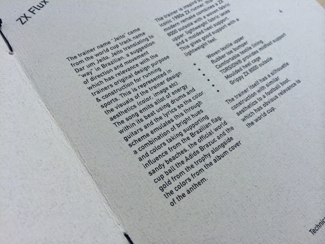
The trainer design itself got its name Jeito from the World cup anthem track name "Dar um Jeito", "Jeito" translates to "Way" in english. The word "Way" suggests a sense of movement and direction which has relevance with the trainers original purpose for running and sporting activities.
I created this sense of movement within the layout and aesthetics through use of angled headers, line elements in the logo and spacious layouts with lots of negative space to allow the eye to move around the page.
Format/Size
The format and size choice came from my original intentions to create a medium to small sized publication, like a brochure. The idea of a square format came last minute from the idea of it replicating the album cover of the anthem that the sneakers name derives from.
Stock
I used off white and pale grey stocks to make the colours within the design work along a constant tonal range as I wanted the colours to work in harmony and not clash and contrast too much.
Colors
Color choice through the sneaker redesign and the publication were used to represent Brazils country flag, emulate energy through vibrant colours, and finally the use of the gold like hue was to simulate the world cup itself. This idea of a gold colour way also suggests a more limited edition feel to the prints and the and the trainer design, as its a Collaboration and specially made for the world cup in limited amounts this limited edition feel is what I wanted.
Layout
Adidas slogan behind the sneaker "less is more" and there idea of a minimalist construction of the trainer was the main idea of creating clean, simple, and minimal design layout.
The layout aesthetics was quite minimal, I wanted it minimal so there were no real distractions from the images of the trainer I wanted to present so lots of white space allowed you to focus in on the trainer. Information and content was also kept brief as it was more of a look-book and a brief overview of everything that has gone into the sneaker concept.
Image making technique
I created the images with adobe illustrator as I wanted a crisp, clean image to work on. I wanted to use block colours to give off a more vibrant tone so using vector line work allowed me to use block colouring with ease. Adidas slogan behind the sneaker "less is more" also inspired this simple image making technique.
Front cover logo
The idea of the front cover logo was to represent the unity and the coming together of 32 nations who are involved in the world cup, 32 glyphs encased in circles to represent footballs all present this idea, and the line element underneath visualises movement and also locks things into place demonstrating unity and coming together.
Publication Evaluation
Based on my intentions of creating a publication based on the concept of a sneaker redesign collaborating with a hip hop artist for the world cup in brazil I feel I have been successful in the majority of the design stages.
The trainer design itself and the prints that go along with it work perfect in presenting forward the idea of the Brazilian world cup with supporting influence from the World Cup anthem lyrics and album cover, the world cup trophy, and the brazilian flag. Taking influence from all these aspects helped me chose the correct combination of colours and tones so all the colours worked in harmony.
The logo at the front of the publication I made was my favourite, it was very lucky that I had 32 characters in the string of words for the logo as it allowed me to simulate the unity of 32 teams which derived from my intentions and ideas.
The publication itself I was happy with but it could have been improved, with the format been quite small, and me wanting to leave allot of white space to give a minamlistic and spacious aesthetic to the layouts the type was quite small leaving readability a bit of an issue, should have really done some more print tests and experimented with a little large print format.
Not happy about the saddle stitch either, would have liked to have coloured thread to represent the energetic aesthetic and Brazilian influences into these attention to detail finishes.
But overall happy with everything and visualised my intentions well enough and only a few amendments need to be made if I carried the project out again.
To round things up I am going to explain the basic concept of my publication and the reasonings behind all the design decisions that have derived from my plan of actions and intentions.
I have created a publication and some prints of a trainer redesign I did for the World Cup, a line of trainers that would be released by Adidas, the main sponsors of the world cup. Collaborating with Wyclef Jean, an artist who has huge involvement in the World Cup Anthem.
The idea of creating a trainer design with a hip-hop artist was a translation of my proposal of linking back to points in my essay mentioning about hip-hop music artists involvement with the fashion industry. I chose Wyclef jean out of all the artists involved in the world cup songs due to his rise of success in the 1980s, this also touches on another aspect in my essay were I mentioned how fashion and music taste within cultures has recycled itself and is as popular today as it was during its origins.
The idea of choosing the ZX flux trainer to redesign is again touching on the idea of fashion recycling from the 1980s to now, bringing back classic styles with modern twists the ZX flux originated in the 1980s.
The trainer design itself got its name Jeito from the World cup anthem track name "Dar um Jeito", "Jeito" translates to "Way" in english. The word "Way" suggests a sense of movement and direction which has relevance with the trainers original purpose for running and sporting activities.
I created this sense of movement within the layout and aesthetics through use of angled headers, line elements in the logo and spacious layouts with lots of negative space to allow the eye to move around the page.
Format/Size
The format and size choice came from my original intentions to create a medium to small sized publication, like a brochure. The idea of a square format came last minute from the idea of it replicating the album cover of the anthem that the sneakers name derives from.
Stock
I used off white and pale grey stocks to make the colours within the design work along a constant tonal range as I wanted the colours to work in harmony and not clash and contrast too much.
Colors
Color choice through the sneaker redesign and the publication were used to represent Brazils country flag, emulate energy through vibrant colours, and finally the use of the gold like hue was to simulate the world cup itself. This idea of a gold colour way also suggests a more limited edition feel to the prints and the and the trainer design, as its a Collaboration and specially made for the world cup in limited amounts this limited edition feel is what I wanted.
Layout
Adidas slogan behind the sneaker "less is more" and there idea of a minimalist construction of the trainer was the main idea of creating clean, simple, and minimal design layout.
The layout aesthetics was quite minimal, I wanted it minimal so there were no real distractions from the images of the trainer I wanted to present so lots of white space allowed you to focus in on the trainer. Information and content was also kept brief as it was more of a look-book and a brief overview of everything that has gone into the sneaker concept.
Image making technique
I created the images with adobe illustrator as I wanted a crisp, clean image to work on. I wanted to use block colours to give off a more vibrant tone so using vector line work allowed me to use block colouring with ease. Adidas slogan behind the sneaker "less is more" also inspired this simple image making technique.
Front cover logo
The idea of the front cover logo was to represent the unity and the coming together of 32 nations who are involved in the world cup, 32 glyphs encased in circles to represent footballs all present this idea, and the line element underneath visualises movement and also locks things into place demonstrating unity and coming together.
Publication Evaluation
Based on my intentions of creating a publication based on the concept of a sneaker redesign collaborating with a hip hop artist for the world cup in brazil I feel I have been successful in the majority of the design stages.
The trainer design itself and the prints that go along with it work perfect in presenting forward the idea of the Brazilian world cup with supporting influence from the World Cup anthem lyrics and album cover, the world cup trophy, and the brazilian flag. Taking influence from all these aspects helped me chose the correct combination of colours and tones so all the colours worked in harmony.
The logo at the front of the publication I made was my favourite, it was very lucky that I had 32 characters in the string of words for the logo as it allowed me to simulate the unity of 32 teams which derived from my intentions and ideas.
The publication itself I was happy with but it could have been improved, with the format been quite small, and me wanting to leave allot of white space to give a minamlistic and spacious aesthetic to the layouts the type was quite small leaving readability a bit of an issue, should have really done some more print tests and experimented with a little large print format.
Not happy about the saddle stitch either, would have liked to have coloured thread to represent the energetic aesthetic and Brazilian influences into these attention to detail finishes.
But overall happy with everything and visualised my intentions well enough and only a few amendments need to be made if I carried the project out again.


Did 2 small saddle stitches, I used 2 separate stitches with this particular method of bind to simulate 2 sets of sneaker laces. Was disappointed vernon street didn't have a larger selection of binding thread as I wanted to carry the energetic and colorful aspects through using bright vibrant thread colors.

No comments:
Post a Comment