Visit to Hepworth Wakefield, Influence on my practice & work from TwoPoints International Studio
I make regular visits to the Hepworth in Wakefield due to it been quite close, they don't change exhibitions very often, usually quarter yearly but through the permanent exhibitions and temporary exhibition's I have been gaining contemporary and historic influence over the past few years not just through university but through my college and foundation studies.
I know I want to position myself within the branding sector, an area of the creative industry that is quite focused in its direction of what kind of work can be produced but I like to gan influence from sources further a field.
The recent exhibition's I visited over this year at the Hepworth have influenced my practice in diverse ways.
I see branding as a way of creating work that lasts, while in a prominent digital age at the moment with focus on interactive and digital design I still think its important to consider the more traditional approaches to design, more craft oriented and tactile with strong theoretical and historic values. I don't want to create corporate style branding work, I want to add more of a creative spin on typical brand identities taking influence from historic and contemporary ideas to produce sustainable and ethical work.
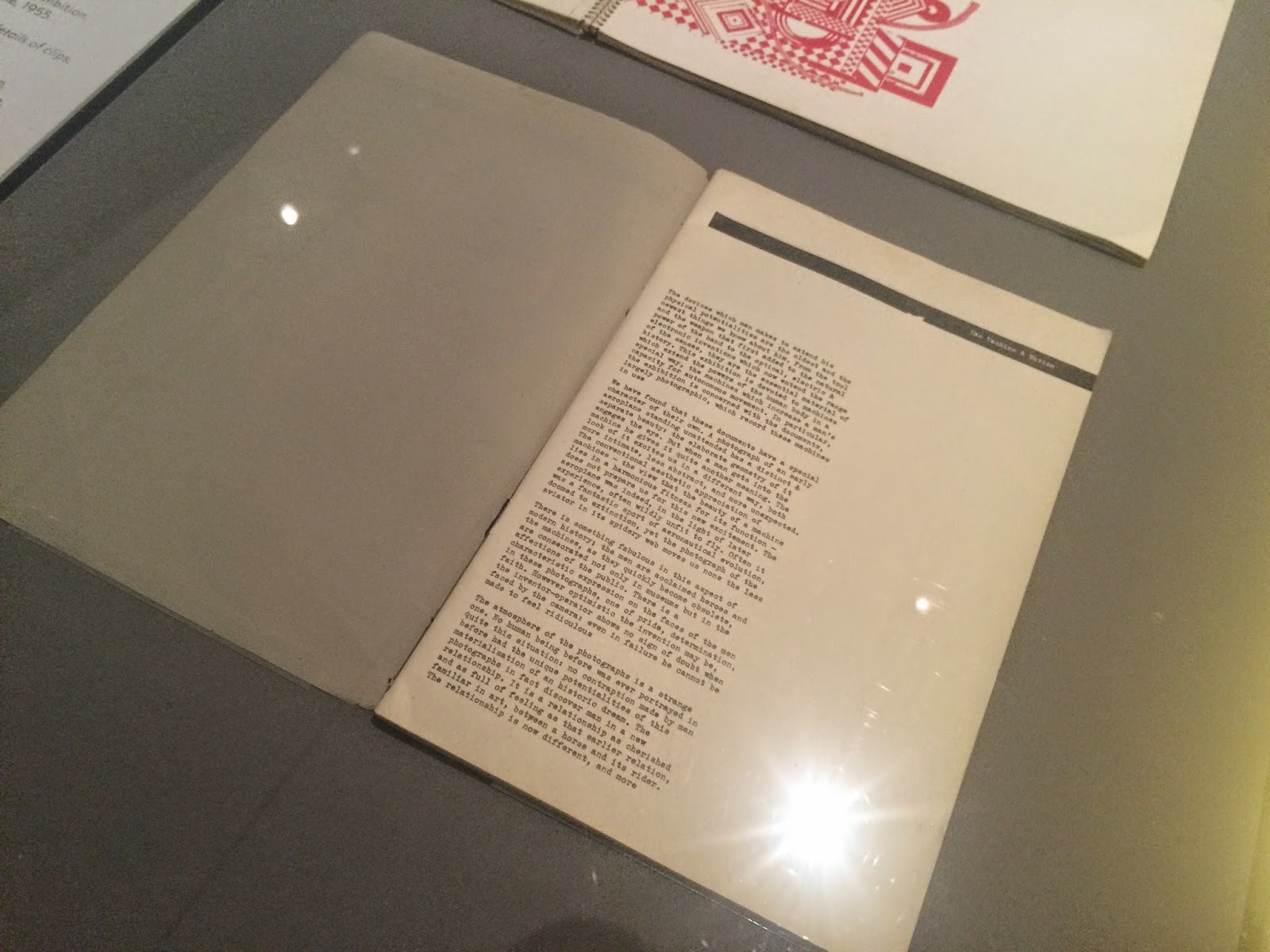
These works from Barbara Hepworth, Naum Gabo, Stanley William Hayter and Lynn Chadwick explore engraving, etching, linocut, lithography, monoprint, screen print and woodcut during a time span from 1890 to 2003 and its interesting to see how when you look at these pieces of work you cant really put an estimate on the time period of production as they all share quite a contemporary aesthetic, these types of production methods have been around for years and the proof is here that they still give off a contemporary and modern aesthetic so if something from this time period can give off this aesthetic why do people seem to think "print is dying out?" it still holds miles of potential for emulating effective ideas in tactile ways. So much more so than digital printing reproductions that have a cloned aesthetic, this method of production produces unqiue outputs, incorporating this into relevant brand collateral will add character and create material that people want to keep, resulting in the target audience remembering the brand more.


The abstract layout and use of geometric shapes is been replicated in modern day design to date so it shows its not just me taking note from these works, there is definite influence to be had from these types of works.

Touching on how modern day creatives are influenced by traditional artworks I noticed the detail within this screenprint by Eduardo Poolozzi in 1971, it definitely visualizes this era in its use of bright and contrasting tones, psychedelic patterns and collage aesthetic that uses iconic political figures, robots & telephones to cleverly communicate american consumerism.


Compare it to the work of TwoPoints design studio I see a modern interpretation of the shapes, colors and patterns used here in a much more minimal aesthetic that thats consideration into graphic design technicalities like layout and more future oriented aspects like interactive digital design. This shows a clear transition and influence of traditional and modern techniques.


The use of layout and aesthetics within editorial design are going full circle too, it was the pioneering period for editorial design and theres a clear link between the layout here and use of column grids.

No comments:
Post a Comment