Practical Idea and Visual Development
The main focus for the brand identity and collateral was to emulate superfoods and there medicinal health purposes through ideas of balance informed from Ying & Yang and the contrast of light and dark to reference Chinese tradition to show consideration to the target person's culture and heritage.
An idea of progression, positivity and change through small changes adding up to a large scale over time needed to be shown through the visualization of health in a contemporary yet minimal way to keep the message concise and print impact low to keep production costs sustainable.
Exploring layout, size, color, tones, type and stock/material choice would be the best way to meet these requirements.
Ideas
Dark green and light green can emulate balance to reference ying and yang and green has connotations of health while darker green has quite a organic feel which references the sustainable and clean sourced ingredients.
Typeface choice needs to be clean to emulate the clean ingredients, a logo type will help support the personal approach and customer connection Lizzy has with her customer base and suit the fact that her name is the focus point of the business name. She is the centerpiece of the business, no corporate disguise so this personality can be shown through a typeface.
Contrast to show balance can be achieved through a clean serif face, serif edges with smooth curves if possible with a slight playful tone of voice to avoid that corporate edge.
A sense of community needs to be created through the layout, good structure with movement in the layout should achieve this.
Color will be the best way to connote positivity and ideas of health while visualizing the ingredients so should be a main focus in the use of stock and color within type and image.
It allows contrast to reference ying & yang health balance.
Pastel colors have a more muted organic feel compared to bright neon tones that could reference chemicals and pesticides.
Grids, lines and angular shapes can show structure and the coming together of people.
Contrast and create balance with type weight, light and bold.
Add color to typography, contrast of tone to create a literal visualization of ying & yang.
To referecne organic, clean sourced and well grown products rustic aesthetics presented in clean ways would work, consider recycled stocks to emulate this.
Play around with a angular sub title for "ALL NATURAL", could act as a stamp of approval for freshness and well being to maintain that customer connection and element of trust. Trust is important in a brand identity.
Consider color theory throughout stock and color choice.
Alternate and deconstructed alignments of typography references progression and the merging together to simulate community. Both important aspects of Lizzys business.
An idea for a loyalty card to use a hole punch instead of ink keeps costs and environmental impact down using less ink.
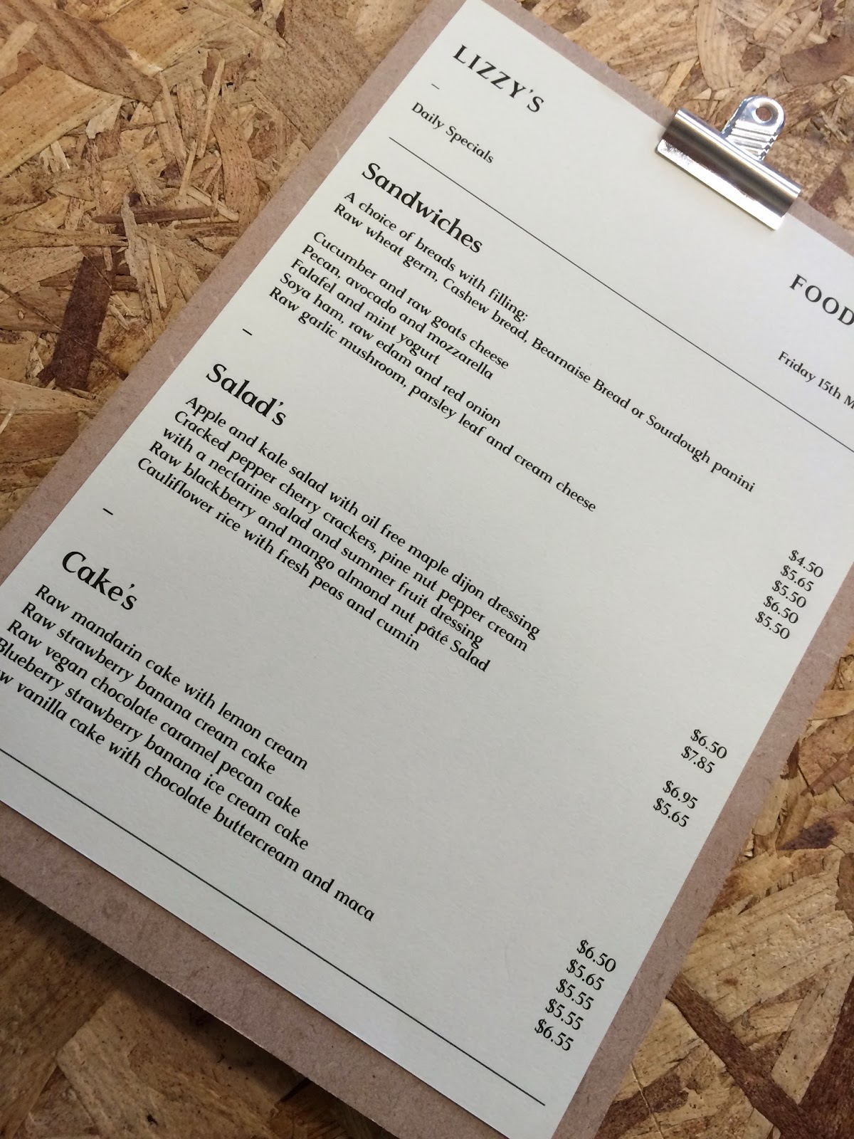
An idea for the in house menu makes me consider the use of material, along with 100% recycled paper or hemp and banana paper boards for the menu could be sourced from off cuts of wood from timber yards as they are often free or very cheap and often wasted. Lower environmental impact and expansion on reusing and repurposing materials seen in Lizzys business plan. Wood also keeps the mage rustic to reference organic.
The structure will be split up, there will be a narrow drinks menu as this is more of a permanent collateral but a proposition for a daily special food menu will be created, using just black and white printing on neutral recycled paper to keep costs and environmental impact down due to the daily change.
An idea at this stage to expand on the personal connection within Lizzy's business plan and organization name is to incorporate her name across all the collateral as a sort of sub brand;
Lizzy's Food Menu
Lizzy's Drinks Menu
Lizzys Health Club - This loyalty scheme has a more personal consideration to health and is less corporate and less focused on marketing as apposed to loyalty card which just try's to give false incentives for spending money for little gain.
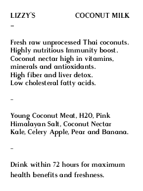
For the bottles and labels the labels will be removable and act as information cards for explaining the benefits of the drink, the ingredients and where they are sourced to expand on Lizzy's consideration to education. Try wrap the label round the bottle and tie round the neck again black and white printing with color addition through stock will keep costs down.
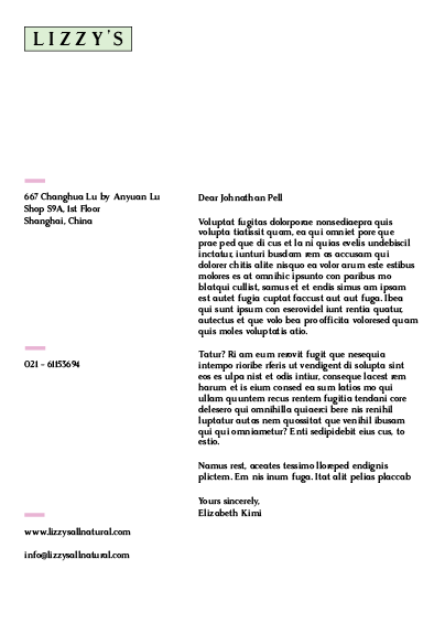
To maintain personal connection a letter head will be created, much more personal connection and less corporate than email. It would be for sending to suppliers for sourcing more clean and organic ingredients.
Play around with large header and small sub title and body copy to expand on contrast and balance while play around with using lines to frame content together and simulate community and the coming together of people.
Lizzy's secondary focus is educating and community, informing people of benefits of her products, clean growing and other health benefits through workshops so flyers for events and workshops will be created.
A sustainable consideration for adding color to the stock would be to have natural food color sourced from the same ingredients she uses in her food and drink added to the recycled paper stock allowing black and white printing to be used a lot to minimize print and environment costs but without losing the main focus of color for presenting positivity.
Typeface was important as it needed to carry the whole brand purpose and personality outlined previous, ten dollar fonts was a great resource as it allowed previews of the typefaces,
Its clean but its too sharp and has quite an architectural mechanical feel, not fitting to a business that focus's on natural organic products.
Playful and references Chinese heritage through the sable style, has nice contrast of weight and angles but it will only work as a header it wouldn't be legible as body copy. The typeface needs to be carried across the whole brand.
Rosemary has quite
Rasmus is what I chose in the end, it has contrast of weight within stems to emulate balance, it has contrast of smooth and sharp within the serifs and ornate elements to the typeface, its very clean yet quite rustic to reference organic clean sourced ingredients. And aesthetically it works with the glyphs in Lizzy. The main focus point on personality and personal approach.
Playing around with the idea of using the all natural as a stamp or approval while using positioning and splitting the word up to reference progression and coming together in community. Started to play around with pink to reflect the producrs purity, quite a pastel tone to keep with the rustic and organic feel. Nice contrast between the white and the pink to reflect balance.
Started to bring color contrast in as a main focus point but this was too heavy, it needed to be subtle and concise method of representing the brand so I started to carry it across into rectangles and brought grey in to further the contrast of tones and a reference to Chinese heritage ying & yang dark and light. The alternative arrangements and positioning are working in terms of visualizing progression while the rectangles frame the words up to simulate the coming together and community focus within Lizzy's business.
A few alternative alignments trying out centre justified and aligning across a horizontal centre with contrasting angles this structure shows consideration to the merging and coming together of people but the fixed positioning looks a little rigid and lifeless, something that needs to be avoided in products that are to promote health and well being.
Business cards need to carry the essence of a brand so the use of 4 main colors to represent positivity and:
Green - Healthy, well being and renewal
Blue - Has a feel of trust and loyalty for the brand, pureness, freshness of products and calmness to reference ying & yang.
Pink - Purity of products and ingredients and a visualization of energy. The focus of the products is to promote physical and mental benefits these color connotations support that.
Yellow - Uplifting, hope & happiness.
The more bright tones had good impact and contrast but pastel suited better as it was a little chemical and plastic feeling with the brighter tones.
Important information needs to be concise and precisely communicated so the layout needs to be simple and the information separated into logical and ordered sections. This example does that but the main focus is balance, theres too much imbalance and negative space.
More structure and balance of space added with the addition of a dash/- as a means of carrying the line used in the Lizzys All Natural logotype through as a consistent visual representation of connecting and community throughout the collateral. The spacing allowed me to carry through sub titles to link with websites, locations and other information with there been a balance between type size within the hierarchy of information.
Using the modular grid system from the business card formed a basis for a consistent guideline for all the content to follow. Allowing alternative alignments and position to be played around with yet still maintain recognition within the brand. This sense of movement further references progression, a key focus Lizzy pays attention to within the clean food sourcing sector.
These alternative arrangements didn't work in all examples though, the labels for the drinks didn't allow much movement as it caused unreadable and illegible digestion of information. As the main focus of these labels was to be educational information presented needed to be concise so a left justification made best use of the portrait format.
There were 2 options to choose from when carrying sub brand/products. Carry the brand color through the use of color application within print. This allowed lots of vigor and energy to be be visualized that connoted the positively and energy of the brand but printing these for the large amounts of products wouldnt be very cost effective.
A more economical solution was to carry through contrast of tone through grey hues with injection of color for emulating products, these could then be printed onto 100% recycled paper, hemp, banana paper with color applied through the use of natural veg dyes. Printing ink would be vegetable or soya inks.
The lines allowed separation of information and carrying on an iconic aspect of the brand while aiding the focus on education and explanation on the products, a main concept of her business was for educating the user on whats in there drink and its benefits. Complete honesty and trust needed to be gained so information needed to be well communicated.
Proposition for a vinyl logo for the menu board, not sure on this though as it would involve digital printing with chemical based inks snd plastic products which goes against the environmentally friendly and clean approach Lizzy was going for.
The letterheads needed to have an injection of personality while maintain a professional tone of voice as it was for suppliers not customers so minimal color was used, the brand color used was green and pink to emulate main aspects of the brand image.
A few alignments were experimented with trying to keep the idea of motion and progression going but this caused difficult reading, communication and precision was paramount.
A more considered and understandable structure was emerging now, I tried bringing in the whole brand name but it caused too much impact, there needed to be balance and this drew the eye too the logo type at the top and away from the body copy.
I started to play around with positioning of sub content like numbers, location and website, linked up with the pink lines. I tried out these pieces of information with titles and without, to keep things well communicated titles were kept.
The food menu concept really took the idea of lines and boxes as a way of showing community, coming together, balance and structure. There was quite a lot of body copy so there needed to be a good structure, while there was a strong balance and contrast within the pt size of the typeface.
The menu will be tried out in color and black and white as it has lots of products that have lots of color potential so the content needs to be shown. Although it could be a little confusing trying to merge all this information together.
Carrying through the green, blue and yellow brand colors through stock choice, neutral colors brown, barley and white are to be used to emulate organic elements and keep that rustic feel while contrasting in tone to emulate the balance within Ying & Yang. All these stocks are 100% recycled and died with natural dyes and to be printed using soya and vegetable inks.
The original yellow was too bright, having a chemical feel so a replacement needed to be sourced.
Bringing in the pink brand color worked a lot better in terms of both carrying the brand identity and positive connotations that link well with the health club.
Digital finals
Black and white prints to save on print costs, to be printed on colored stock. Stock will be 100% recycled, hemp or banana stock dyed with natural dyes and printed with soya and vegetable based ink to keep with the sustainable theme of the business.
Injection of brand color scheme and connotations carried through product range tags.
Decided against the use of a sticker as it didn't seem ethically viable, every piece of collateral had a justified production method but a vinyl sticker couldn't be sustainably produced so this idea was scrapped.