Final Practical Response and Rationale
Lizzy's All Natural is a company based in Shanghai China, an advanced city that has issues with pollution across the air and ground causing problems within sourcing clean grown food. Lizzy sources super food ingredients for food and drink products that are packed full of medicinal benefits with incredible health benefits.
Within her product ranges she educates the end user on benefits of the products they consume while communicates honest information on the sourcing of the product. Maintaining a strong trusting relationship with the end user.
She holds regular workshops providing education on sustainable growing, preparation and cooking of superfood ingredients. Informing them of all there singular benefits and combined benefits. Through this education and supplying of quality products Lizzy aims to make a change within Shanghai where all food products are full of preservatives and the "fresh" ingredients sourced from farms that grow with chemicals and pesticides and the ground is heavily polluted.
Focused concept
Focusing on the heritage of the target audience theres an overarching influence from Chinese medicine and its links with Ying & Yang and the theory of balance within this to maintain a good healthy life.
Through the exploration of colour, typography, layout a sense of community, healthy, progression, sustainability and education will be portrayed.
Rasmus references the Ying and Yang balance focus through its contrasting weight, smooth and sharp ornate serif and its clean aesthetic to reference clean sourced ingredients. The use of Rasmus for the logotype also shows focus on Lizzy's focused approach as an image based logo would lose this personal connection.
Physical outcome's & Purpose
Lizzy has a focus on educating and bringing together people in the community, flyers where made for informing people of these events while the use of pink draws people into these important workshops while the connotations of trust and purity reference the honesty and the benefits of these educational sessions.


The brand colours are carried through within the banana paper business card. The colour scheme connotes; loyalty, trust, health, purity, organic, clean sourcing, renewal, positivity, freshness and energy. Showing the importance of color and why its my main focus within the identity.


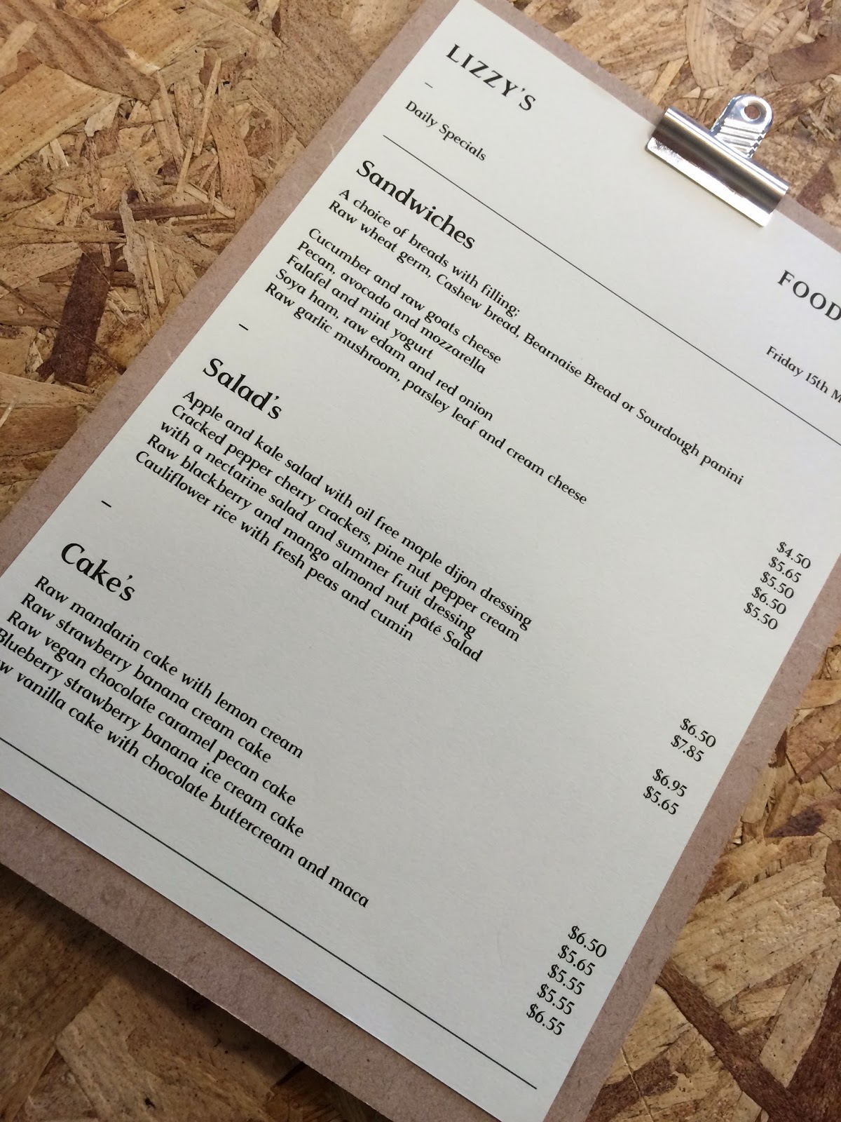
The menu board is recycled MDF cut offs that are to be wasted sourced from timber yard's while the neutral paper is banana paper and the green stock 100% recycled paper coloured with natural green dye. Green emulated the idea of progression and renewal while referencing the main brand purpose of health and well being.


The drinks menu will remain consistent while the food menu changes with daily specials of raw and organic meals printed in black and white to keep costs down with the use of lines framing up the content and extending on the lines used within the brand identity that reference connections and community.

The health club card is a loyalty scheme encouraging people to engage with Lizzy's products offering them an health driven incentive. Pastel pink stock was used, pastel tones have a more organic feel while connoting health and purity while the use of a hole punch to track purchases takes consideration to the environment by not using ink stamps.


All the collateral is made of 100% recycled or sustainable stocks and materials with the use of soya and vegetable inks for printing to keep a low environmental impact. The colour scheme is carried through the collateral and connotes all the positive elements of the business while referencing the products themselves.
The letterhead carries ideas of personality unlike email, avoiding the corporate aesthetic Lizzy wanted to avoid.


Lizzy's personal connection with the customer is maintained throughout all the sub products, the use of Rasmus typeface allows injection of her personality and the brands personality.


Contrasting stocks to carry through the feel of balance with each colour stock connecting with and referencing the products.

Blank glass bottles are to be used so they can be re-used for other products or re-purposed for other uses like vases.


No comments:
Post a Comment