Wednesday 13 January 2016

OUGD601 Overall Evaluation

OUGD601 Overall Evaluation

1. What skills have you developed through this module and how effectively do you think you have applied them?
I have continued to expand on my theoretical writing skills from last year, something I began to find myself doing quite well in. This year I developed my researching skill, figuring out how to really critically analyse a source, fully stripping it down and extracting quotes and arguments and investigative points based around a certain question or focus point. Creating a 20'000 word document for all my extraction of research has really helped this year as I was struggling to find the right information by over saturating myself with information I could then go back and extract quotes and research more efficiently and with more focus.


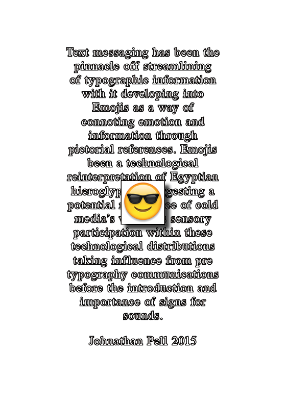
My typographic knowledge and knowledge on technology has grown no end through my research and I feel the information I have taken in has informed my practical response and will continue to feed into my extended practice. 

Knowledge on communication, an essential key to my practice and something I should have looked deeper into before, learning how information is digested will help me create stronger concepts and outcomes within extended practice.

Triangulation, gathering alternative research relating to different subject areas as well as other theorists relating to the same argument has helped strengthened stronger arguments within my dissertation, a good example of this was the merging together of arguments made revolving around music and typography.

Expanding from last year coming out of my comfort zone and experimenting more both within my practical trying out quite abstract techniques to change the way messages can be visualized but also with research, reading into much heavier theory books as apposed to last years safe branding books looking into writing's from McLuhan and Mcquail has taught me a lot more about the theory behind media's an effective subject area that relates to graphic design practices.

2. What approaches to/methods of design production have you developed and how have they informed your design development process?
Within my practical I have learnt to synthesis theory into a practical response, basically visualizing iconic arguments and my conclusion of my essay. 

Using practical work as a form of research in itself has developed not only my practical outcome but also informed my investigations into my essay (Screen print & Digital print posters) 

Editorial design, merging together technology and traditional principles, both important factors for a graphic designer who appreciates progression but also understands the communicative potential of traditional principles. 

Use of color and paper stock to communicate tradition and contemporary concepts. Appreciation of traditional typography and the appreciation of technology and software for potentially changing the way type can be communicates, something that will be explored in Extended practice.

3. What strengths can you identify in your work and how have/will you capitalise on these?
Typography, both traditional and contemporary in experimental ways and ways that communicate information effective. I will continue to develop both these contrasting skill sets because my essay proves that theres potential for both mediums within this progressing digital age. 

Organization and layout, after learning how information is communicated through my findings my layout and how information hierarchy through typography has developed. I will carry on looking into traditional layouts and contemporary layouts and how to make the most of both principles to create focused and strong outcomes. 

I developed my conceptual thinking a lot more when it comes to applying a synthesized theory gathered from an informed investigation from successful research allowing me to create a successful practical outcome even when I did mess my time planning up the concept was strong and the visual resolution strong.

4. What weaknesses can you identify in your work and how will you address these in the future?
Aesthetics, the concept was there but more impactful aesthetics could have been made. Also the use of typography could have been experimented more, I chose 2 safe blackletter and roman typefaces I should have explored some more that could have merged together contemporary digital influenced black letter and roman and more traditional ones to show the progression of these typographies.

5. Identify five things that you will do differently next time and what do you expect to gain from doing these?

Plan my time a lot better when it comes to the practical, I really didn't leave myself enough time and I really wanted to carry out the laser cut letterpress ideas as this would have been the perfect practical synthesis. Its a concept I will certainly be taking into extended practice though. 

Gather primary research, I can get more informed opinions by focusing questions asked around a given theme that will help strengthen arguments and support secondary sources. Better time planning and not been scared to contact people! 

Develop my practical more, the concept I had even after the letterpress one failed had so much potential with terms of experimental type to visualise digital progression but I didn't have enough time to fully commit to crazy aesthetics like I found in my visual research. 

I was exploring technology, actually creating something digital that transitioned into print, something augmented and interactive would have been perfect. I really need to teach myself digital practices like moving image, coding and video editing within extended practice to expand my practice and expand on my COP within extended practice. 

Consider target audiences next time, like my investigations into branding provided typography can be very manipulative. Learn how to capitalise on these manipulations. 

Practical Rationale & Finals

Practical Rationale & Finals 

Concept
Create a series of self published type specimens using traditional black letter fonts and roman fonts and there Gutenberg influenced distributions as a reference to traditional principles when it comes to the visualization of the spoken word. Deconstruct and produce these using experimental accessible digital softwares and printing hardwares to show the introduction of cyberspace technologies as experimentations that have caused a transition of how information is communicated and distributed from something that was a hot media that was digested slowly creating a literate society. Today the development and streamlining of communication systems as a reaction to technology and cultural conditioning has caused a decline in slow digestion of information turning it into something more visual and hot requiring less sensory participation much like it was in pre typographic movements. 

To place this theory into context evidence suggests that these ideas of repurposing could be visualized through the digitally recycled emojis that could be seen as a technological development of hieroglyphics, something that predates typography. The secondary purpose of the outcome is to show how even with technological innovation there has been a repurposing of pre typographic and traditional typographic communications showing that we accept progression but still always take influence from historic communication strategies to streamline how effective information is digested within a fast paced society.  

This ties in and progresses from past practical investigations locate here.

Finals & Rationale 
Front cover uses layouts that reference Letterpress & Gutenberg traditions with a classic Gutenberg Black letter face, using black ink as a reference to the limited color options available with these mass distributed print process's. Roman typeface Times was used but set using the potential of digital softwares with underlining and strike throughs to show the progression and of how type can be distributed through technologies but still maintain an aesthetic that references traditional print. 

The title references the introduction of mass distribution to the introduction of cyberspace technologies and how its effected multiple communicative mediums like music and typography, both underwent transitions from been something verbal to the progression into something more physical then re-purposed back into hosted distributions through cyberspace technologies. All quotes relate to there subsequent digital manipulations. 

The simple comb bind and double side A5 print using a home printer references easy to access print process's.

Contrasting bright inner leafs contrast the clean stock used for the copy pages, this references contemporary print distributions. Each leaf will support and mirror the body copy's digital experiment. This spread referencing the decline of respect for the Gutenberg through the blurring out of classic Gutenberg type choice (Blackletter) and layout (Left aligned) 

Cut and paste aesthetic referencing traditional hands on approaches to type layout before digital softwares, also drop shadow references computer windows. 

Deconstructed layout shows how typography used to be a method of slow method of digestion, a hot media where actual sensory interaction was required to take in the information. Now with a growing illiterate society and communication methods becoming more streamlined and visually cold in terms of sensory interaction these types of digesting information are becoming lost. 

Pixilation to show transition between print and digital distributions. 

3D to show the transition from physical typography used in letterpress process's to 3D rendered and more abstract and visual typographic visuals. Backing up arguments made that its becoming something more visual and type can now carry concepts rather than just be communicative. Something else explored in my screen print & digital print posters. 

Tongue in cheek representation of the streamlining of typographic distributions through phonetic technologies from full word texting, to abbreviations to emojis. A digital repurposing and re-introduction of an illiterate society when Hieroglyphics and no typographic systems that placed spoken words into a visual system were about. 

=)

Practical Idea & Visual Development

Practical Idea & Visual Development

Scamps & Idea development 
Taking forward further ideas generated from research to support my concept a plan and idea generation process was started. Ideas explored where to:
  • Record the process of making the publication within my bedroom setting to show the possibilities of home publishing through accesible softwares and hardware but still create equally effective communications. 
  • Show the streamlining of typographic communication with an end result showing emojis from this journey. 
  • Show the digital repurposing of traditional typography and principles to show how communication has been repurposed using digital process's to change how its communicated. 
  • Show how digestion of type has developed through the use of digital design tools as a development from physical production and distribution tools.
  •  Use Rasmus & Madras for the transitioned digital typography morphed from experimental editing and manipulation of traditional blackletter and roman fonts. It also applies synthesis from my actual essay. 
  • Create a scale of progression showing simple principles; Legibility, Visual interaction, minimal interaction pictorial elements. 
  • Use the digital repurposing of typography from traditional to digital manipulation to show key periods of how certain technologies have developed how typography communicates. 
  • Consider how to show a range of possible styles of the 2 fonts ie different sizes and weights as it is a type specimen and the purpose is to communicate the types possibilities as well as its future digital communicative potentials. 

  • Gradients to reference technology and provide synthesis from past experimentations with screen printing and digital print back at the beginning of the year. 
  • Layout main bodies of type within the limitations of letterpress, the digital manipulations will break these rules and show the potential of digital tools and how communication methods can be changed.
  • Extract quotes from essay, relate the manipulations to what these quotes talk about and evidence to show synthesis. 
  • The format will be a simple A5 booklet stitch bound. To start with the designed layouts will be made using indesign as a digital tool but replicating the limitation's of Guttenberg printing with classic Black letter and Roman fonts to show iconic typefaces within the development of typography been "signs for sounds" and transitioning into specifically designed and produced typefaces for mass distribution technologies. These layouts will then be manipulated using photoshop and illustrator to demonstrate and visualize iconic technological shifts on how typography is communicated and distributed. 
  • To keep with the theme of type specimen inner leafs will be used to demonstrate the typeface used in the quote in varying styles and sizes to show the versatility of digital techniques even when using traditional typeface choices.  
  • Each inner leaf and quote page will be mirrored with the digital manipulation to show the digital transition side by side. 
  • As an expansion of my current practical research with the screen print & digital print posters the use of preset filters within digital softwares will be used to show western society's over reliance of technology. 
  • Ideas to visualise through digital repurposing: Cut & Paste (References old type layout before publishing software, Pixilation (Show transition from physical print to screen based distributions), 3D (shows the repurposing of typography as it used to be a physical thing for letterpress, then transitioned to digital typeface but now theres been an insurgence of 3D rendered custom digital fonts), Breaking up/Deconstruction/Blur (Shows how the purpose of typography has been deconstructed and is no longer digested in ways it once was, little or no interaction is required to digest information so this shows this change), Transition between typography to texting to emojis with support from presets to show cyberspace technologies. 

Digital development 
Modular grid to reference pixels as modular grids are often used for screen based outputs, shows a merge between physical print and digital considerations with the margins following Guttenberg layouts as a reference to traditional mass distributions. 


Goudy and Times new roman where used for the Blackletter and Roman typefaces, both iconic style faces used in pre-digital type distributions and productions. The centre aligned and left aligned setting references layout limitations with these pre digital physical techniques, repurposed in digital ways. 


A frame was added to reference the furniture used in letterpress but the balance of the page was lost as I wanted a very minimal layout as the focus was the text and the quote and the contrasting experimental manipulation. 

A few layouts where tried with the type specimens, this elements focus was to show the possibilities of modern and accessible print process so alternative type layouts could be played around with making the most of digital process's. Vertical positioned subheads describing the typeface and pt size suited better when it comes to the balance and structure of the space. 

Bringing the original edits into manipulation softwares, turning the typography into repurposed edited images references the repurposing of typography to pictorial elements but still maintain communicative concepts. 


Playing around with preset filters to expand on current investigations into preset's within technology. 


An idea to find supporting quotes to add context to the now disrupted typographic layouts was tried but it drew attention away from the digital experiment and this was the focus of the concept. 

The deconstruction and 3D edits where done manually but show how efficiently digital softwares can be to completely change the communicative purpose of type with a few clicks. 


Digital files ready for print & Pagination change 


Cut and paste aesthetic with drop shadow that references computer windows, an effective but simple representation of traditional and digital repurpose's and transitions.


The front cover has past dates iconic to communication, progressing from when first moveable woodblock types where created to the mass distribution of type too the current day with a title synthesizing investigations into how music has undergone a similar transition within its distribution through technology. Both music and typographic communications developed in similar ways. 


Tongue in cheek addition to add context to a theory I came up with relating to the development of language refining down to pictorial elements that are digitally repurposed hieroglyphics. Something that was pre-typographic.