Practical Visual Research & Supporting Quotes
Based on the synthesis concept and findings from the conclusion a mood board of visual research has been gathered with supporting quotes from further research and expansion on current research as an extension of current arguments and information gathered.
Concept
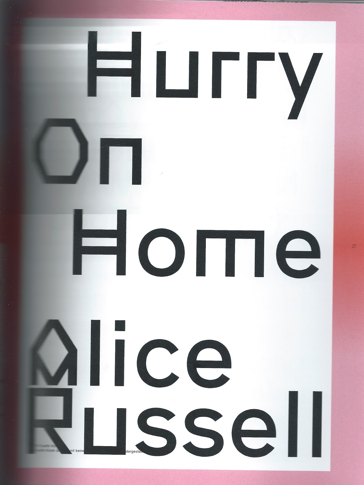
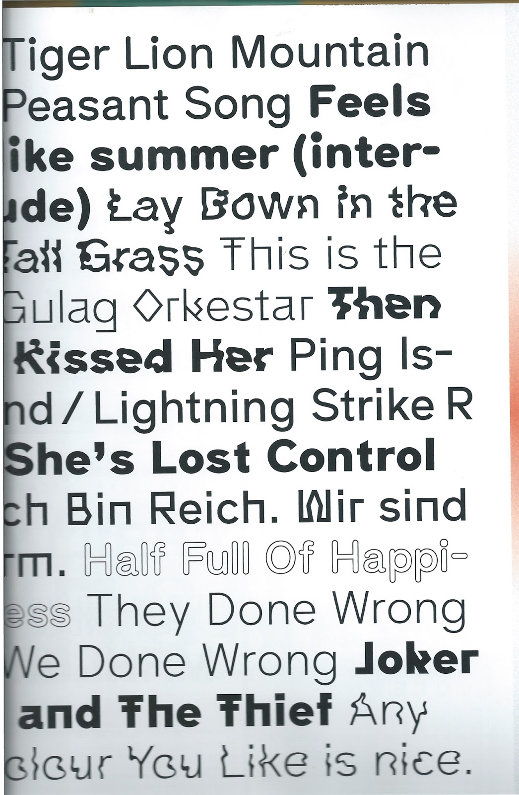
Create a series of self published type specimens using traditional black letter fonts and roman fonts and there Gutenberg influenced distributions as a reference to traditional principles when it comes to the visualization of the spoken word. Deconstruct and produced these using experimental accessible digital softwares and printing hardwares to show the introduction of cyberspace technologies as experimentations that have caused a transition of how information is communicated and distributed from something that was a hot media that was digested slowly creating a literate society. Today the development and streamlining of communication systems as a reaction to technology and cultural conditioning has caused a decline in slow digestion of information turning it into something more visual and hot requiring less sensory participation much like it was in pre typographic movements.
To place this theory into context evidence suggests that these ideas of repurposing could be visualized through the digitally recycled emojis that could be seen as a technological development of hieroglyphics, something that predates typography. The secondary purpose of the outcome is to show how even with technological innovation there has been a repurposing of pre typographic and traditional typographic communications showing that we accept progression but still always take influence from historic communication strategies to streamline how effective information is digested within a fast paced society.
Supporting research
Taking influence from research gathered from key books relating to typography will provide an abstract view on the communication of typography to relate to ideas of experimentation and progression in contemporary ways but still taking into account the communication aspect of the principle.
Particular focus will be made on experimentation as a way of informing ideas that visualize digital technological developments within the cyberspace age as this transitionary period was a complete experiment and it shows the vast change and unpredictability communication is going through.
Particular focus will be made on experimentation as a way of informing ideas that visualize digital technological developments within the cyberspace age as this transitionary period was a complete experiment and it shows the vast change and unpredictability communication is going through.
TwoPoints.Net (2012). Pretty Ugly Visual Rebellion in
Design. Berlin : Gestalten.
p3.
Deviant. Against Established criteria of what good design is.
Embracing what is disliked and considered incorrect. Mistakes become virtues,
create authenticity and humanity.
p47.
Mundane. Converting ordinary into extra-ordinary, old into new.
Elevating ugliness to a new kind of beauty by changing its function or message.
The mundane attracts the attention of those who find perfection boring.
p79.
De-constructed. De-construction out cultural heritage: Breaking it
down to its basic elements until it can be constructed as something new.
Authorship as a process of deconstruction and construction.
p103.
Impure. Unpredictable textures, intentional randomness and seemingly
un-composed works. Simple structured compositions turn into complex surfaces
allowing for more than a single perception.
p153.
Mishmash.
Interlaced images establish new meanings and space. Multi-layered graphics
reveal their process of creation, displaying a before and after. Within a
single piece, several stories are visualized simultaneously.
p175.
Deformed.
Distorting forms of well-known shapes with digital and analog tools. Tearing
them apart until they become nearly illegible and lose there original function.
Yet illegibility is not the goal, the deformation is often an escape from the
unaltered, impersonal. It is an attempt to create an unique piece of work.
p203.
Neo-artisanal.
Why distinguish between digital and analog tools? They become self-evident
neither of them need to be proven right or wrong, better or worse. Digital and
analog are interwoven and dominating both fields is a necessity for
contemporary craft.
Interview
studies
p188.
Rob
van den Nieuwenhuizen – Drawswords
I
just loved fooling around with typography and (mostly live) pictures and, in
hindsight, making the most horrid stuff. But it was sincere.
Since
I couldn’t draw at all, my high school teachers advised me not to purse a
career in art and design and because I always had a think for languages and
writing, I decided to become a journalist, screen writer or copy writer)
I
didn’t like the, in my view, really boring and old-fashioned way a lot of my
teachers looked at or practiced graphic design.
It
was then that I found out what I was missing in the stuff that I had been
doing: the connection with language. I just never knew how to combine the two.
(Changing the way typography communicates from traditional
principles to more experimental process’s rejecting typical aesthetic
acceptations of design and focusing on how language is communicated with strong
influence from prior knowledge focused on communicating information in a
contextual basis as apposed to aesthetic)
So typography become my main interest and point of focus during
the rest of my study and still is. The way it combines language and a visual
world is really inspiring to me. Its just something I never get bored with
(which is quite remarkable to me) and I love every aspect of it.
(A modern interpretation of how typography developed from a spoken
language placed into basic visual communication through letters and then placed
into an organized system known as typography)
p190.
The internet has made out world larger and smaller at the same
time, which also can be seen in terms of graphic design. Perhaps aesthetically, design has become much
more eclectic, combining large ranges of styles, attitudes, techniques, and
kinds of information.
Q.
The KABK is known for its tradition in type design (Haagse Letters). Using such
profane typefaces as Times or Helvetica and pushing a text close to
illegibility isn’t exactly in line with KABK tradition. Are you aware that you
are breaking with tradition?
A.
I had a great time at the KABK but I never really felt a connection with that
tradition. Actually, I remember lots of times where I drove some of my teachers
mad by setting a book in a display font, or using a font made for extremely
small sizes on a huge poster.
(Talking about time in the in house design agency at the Royal
Academy of Art)
Even
though I’ve never been a fan of rules, I feel its quite important to know what
they are before you decide to bend or break them.
(Importance of knowing traditional typographic principles based on
focusing on communication of information, before changing the context of how
typography is distributed)
Critical
analysis of visual work
Deviant
chapter.
Breaking
typical hierarchy of information through a deconstructed and fairly unbalanced
composition with clashing weights of typefaces, styles of typefaces and the
contrasting use of uppercase and lowercase.
Clashing
colors defy typical use of color theory while angled and diagonal type
contrasting with vertical and horizontal type deconstruct and visualize motion
within the design as another method of deconstructing typical rules.

Typography
can communicate concepts through strong visual outputs, this identity for Love
is Cocaine has abstract imagery and typography that work together in an
interactive and engaging way.
The
idea of magnetism and attracting denotes the longing, melancholic mood of the
song. The warped imagery interacts with the deconstructed type with supporting
iconography that communicates the idea of magnetism and attraction but also the
arrows change the typical method of hierarchy and provide direction of reading.
The
deconstructed glyphs allow versatile application of the concept across a range
of collateral while still maintaining the abstract representation of attraction
and the alternative hierarchy of information.


Great example of how traditional print distribution methods have
been repurposed to produce very contemporary designs, the range consisted of 24
hand printed A2 posters, 16 A0 posters, 30 different flyers, 20 A3 folding
posters and a program booklet for the Festival of the Arts in Zurich.
Laser cut letterpress blocks where designed for the printing blocks,
this use of digital software and contemporary production technology is a great
way of using modern technologies but creating a traditionally produced output.


Deconstructed chapter.
Posters created for Grafik Kiosk are outputs produced from under-generated
inputs into a digital program that runs through deconstructed traditional
layout compositions and a complex rule system.
The concept was to create a digital graphic designer, to produce
an outcome design decisions are not made, instead the user tells the program
how they want the design to look.
This is an interesting approach to using typography to communicate
messages without worrying about traditional principles and rules and having
creative freedom and approaching the use of typography with an open mind.

The font itself was designed specially for the computer program;
the concept of the font is based on the proportions of A4 paper and has 12
varying cuts. Each font has a light, regular and bold variation that share an
abstract, rounded and wiggly version to add even more variety to the visual
content generated outcomes.
The idea of using a digital program to undergo a repurposing of
the traditional use of typography is a very interesting concept worth
exploring, as there are a number of rules and guidelines a program needs to run
by it loosely references the use of rules typical within traditional
typographic principles.

Mishmash chapter.
The concept here was to use HTML as the main starting point to
communicate a language that cant be understood by the general public, then translated
into posters that communicate time, space and fiction.
This interpretation of a coded language into a decrypted format
relates well to my research into how typography was the visualization of spoken
language into an organized system.

Deformed
chapter.
Work
from Rob van den Nieuwenhuizen playing around with how far he can push the use
of common and traditional typefaces like Helvetica and Times to near
illegibility to completely alter the context and typical uses of the typical
rules of typography. He focuses on communicating a message through the
aesthetic manipulation of traditional typefaces, this has lots of potential as
a means of showing how type can break out of its traditional principles and
communicate ideas and concepts in much stronger ways.

Neo-artisanal chapter.
These posters for SAVE merge
analog and digital into an outcome that is produced using a traditional base
point for the type choice but repurposed into a visual output that has
contemporary aesthetics.

Traditional
black letter font style repurposed into a more contemporary digital aesthetic
positioned within the center aligned and 1 color restrictions of physical
letterpress layouts but printed digitally with a contrasting clean cut
traditional serif font to strengthen the ideas of analog and digital a little
more.

Davis, M (2012). Graphic Design in Context - Graphic
Design Theory. London: Thames & Hudson.
p120.
Although
the American approach to typographic modernism showed less allegiance to rules
than the European version, the goal in these exercises was still to manage
contrast and hierarchy within a limited pallete of choices: to explore rhythm,
coherency, convention and unpredictability, and legibility and readability in
layout within certain typographic constraints.
(Pretty ugly relations and the pushing of boundaries of typical
typographic principles)
Modernism
the utopian vision – Chapter 5
p137.
The
technological image
In
this machine-centered environment of mass production, the application of
technology to image-making was the next logical step.
(Relate to the development of the Mac and software like Photoshop)
Triggs,
T. (2003). The Typographic Experiment:
Radical Innovation in Contemporary Type Design. 1st Edition.
China. Thames & Hudson.
P7-8.
The
Typographic Experiment: From Futurism to Fuse
Typographic
Language
The idea
of experimental type design and experimental typography is explored here from
the inception of an idea, through the research process and into a ‘commercial
application’. As two distinct disciplines, experimental type design deals with
design or production of typefaces, while experimental typography investigates
the use of type in layouts. Type is the ‘symbolic’ representation of language
in its mechanical (or digital) form. Type design is not only about the way in
which individual letterforms are constructed; it also involves the systematic
application of these elements across a set of characters. Conversely, the
typographic layout structures the characters – into words, lines and ultimately
texts – to produce meaning in the way they are organized visually. The way the
typographer presents the ‘page’ takes into account content and form, the
materials, the way the page is produced and knowledge of the target audience.
P10-12.
Western
traditions in writing and the development of language itself have been
questioned throughout the twentieth century. Dadaist Kurt Schwitters
(1887-1948) argued that one of the principles of the new typography should be
to ‘do it in a way that no one has ever done it before’. His interest in the
interaction of signs and sounds (optophonetics), for example, resulted in a
typeface in which the weights of the vowels were heavier than the other
characters.
(Link with how typography was a development of the spoken word into
a visual system)
P12.
Herbert
Bayer (1900-85), who taught at the Bauhaus, experiments with similar ideas and
designed phonetic symbols for syllables in 1959, where ligatures stood for
sounds created by the combination of letterforms. He wanted to produced a
computer face that reflected ‘his rules for a new orthography’ to ‘eliminate
all discrepancy between spelling and pronunciation’ in Western phonetic
alphabets. In the 1990s, Tobias Frere-Jones took this one step further for Fuse
15: Cities (1999) by recording peoples conversations as he passed through the streets
of Boston. These texts formed the basis of a typeface called Microphone is the
language of the street, reflecting how people talk to each other. It also
considers new ways of telling stories in which the font becomes the structural
framework.
P12.
Typography
and its Swiss roots.
The
introduction of new technologies has long been an initiator of typographic
experimentation. In the late 1960s, Swiss designer and educate Wolfgang
Weigarts choice of tools for ‘making by doing’ were more suited to the technology
available at the time – hand composed lead type, hand-printing letterpress,
wood letters and transparent films. The consequences of combining these media
created a new typography and visual aesthetic that has since influenced many
contemporary designers and typographers who are engaging with computer
technology.
P16
The
ration of signal to noise was arguably diminishing. Typographic forms were
transformed into abstract shapes, similar to the old demotic hieroglyphs of the
Egyptians, which became ‘progressively abstract’ and less skillfully made as
they moved from targeting an elite audience into ‘written communication for
popular activities’. The new demotic typography redefined punctuation,
substituting conventional marks (dots, commas, dashes) with ‘idiosyncratic
devices’ (arrows, backward letters, diagrams, boxed words). Butlers critique of
early 1990s experimental typography focused on computer technology, which she
suggests facilitated a formless, series of pages containing a ‘mix of old and new
letterforms, type and script, changing letter direction, overprinted images,
changes of scale and ambiguous syntax. The visual complexity of the typographic
page had been defined by a decade of typographic experimentation.
P21
Typography
and Technology
In 1964,
cultural philosopher Marshall McLuhan (1911-80), coined the phrase ‘the medium
is the message’. He proclaimed ‘technology was an extension of our senses’ and
with each new medium we encountered new ways of experiencing perceptual
transformations. For McLuhan, it was the form of electronic media – which he
categorized as ‘hot media’ (radio, photography, cinema) and ‘cool media’
(telephones, cartoons, television) – that triggered the rapid speed at which
information was produced and consumed. His theories foreshadowed the impact
late-twentieth-century communication technology has had (the Internet and World
Wide Web). As McLuhan suggested, we have moved from a mechanical age into an
electronic age.
(Link technology to our sense as in speech and how this relates to
typography been a technology that places speech into a visual system)
P24-25
Designers
sought to name their ‘self conscious explorations of language and designs’,
adopting the theoretical position of deconstruction as espoused by philosopher
Jacques Derrida in De la grammatologie (Of Grammatology 1967). Already applied
to literary and architectural criticism, Deconstrucon has never been fully realized
as a theoretical construct for design, although it has presented designers with
a new way of thinking about verbal content and visual form. Jorge Glusberg
writes, ‘Producers and consumers of texts (cultural objects) thus intervene to
play a part in the elaboration of significance and meaning. Designers and
curator Ellen Lupton writes ‘A study of typography and writing informed by
Deconstruction would examine structures that dramatize the intrusion of visual
form into verbal content, the invasion of ideas by graphic marks, gaps and
differences.’ Visually, Deconstruction is usually defined by ‘a style featuring
fragmented shapes, extreme angles, and aggressively asymmetrical arrangements’.
She argues, however that for her, Deconstruction is a ‘process – an act of
questioning’
But
where has this led us to today? The convention of reading in terms of
legibility and readability, have been questioned in the construction of
letterforms and their place in the typographic layout. Once accepted formulaic
and simplistic typographic structures have been re-examined in light of the
complexities offered by a new information age and new systems of writing.
(Digestion of information and how type has reacted)
Hamis
Muir
P33
Formal
“information-based” problems require an analysis of underlying information
structures and hierarchies through which forms of typographic expression are
suggested and then modulated visually to an appropriate level during the design
development and in the finished piece. Typographic systems, with rules and
logic.
Lucinda
Hitchcock
P151
Typography
is the design, choice and arrangement of typeset matter, and is shaped by
conventions that aim to create legible and accessible reading material.
Experimental typography challenges the notion that legibility and the message
are primary, rather asking that the maker/user/viewer consider other
characteristics that are inherent to type. Like many conventions, typography is
old and revered. Like paint, it can be used to show something akin to the truth,
or it can be asked merely to suggest. It can be dressed up or down. Typography
is nothing without meaning, and meaning is nothing without questioning. And to
experiment is not to seek an answer but to serve the question.
P177
Typefaces
based on Renaissance, nineteenth-century grotesque, or twentieth-century
Modernist models – all of which may have been considered experimental initially,
but have become canonical with widespread use (though unexpected permutations
or juxtapositions of these types can be experimental)
(How typography was an experiment in itself for the benefit of
communication)
Experimental Aesthetic visual influence
To support the further bodies of research a large body of aesthetic research will be gathered to influence ideas relating to my concept and rationale.
Universal Everything
Shows how typography can become a pure visual aesthetic with the inclusion of modern moving image techniques.
How typography can take influence from something abstract like architecture and form and be created into something that communicates multiple concepts. Versatility, an expansion on communication showing how these technologies within type really are an "extension of our senses"
Field x Monotype
Exploring the future of typography through technology and digital mediums.
Bringing in influence from audio inputs to generate automated design outputs.
Expansion on Monotypes appreciation of technology visualized in abstract and experimental ways.
Proving type can be responsive to change, carry emotion and still be communicative. Inspiring the main concept of visual experimentation within my ideas. Merging art, design and technology.


Loes Claessens
Expansion on ideas of experimentation and visual impact as a form of emotive communication.
Glitchy aesthetic shows technology and cyberspace vibe.
Internet and 90s references, key periods of cyberspace communication developments with the inclusion of type as an extension of communicating these values.


Manita Songserm
Disregard for order, the main purpose of typography. Flipping the way its communicated on its head to something more interactive through the deconstructed abstract rule breaking layouts. This could bring back ideas of hot media where actual sensory interaction is required but in this case with a more visual consideration.


Ruben Montero
References analogue pre digital technologies like photocopies and limited black color palettes with the use of simple communicative words. Consider the use of words within my type specimen rather than the typical A-Z in varying weights, have it read as more of a story of communication through quotes and words.


There Is
Turning type 3D and adding a complete digitally abstract and rendered feel, showing 3D and these abstract yet playful outputs shows a strong influence of technology, if the starting point was something blackletter and traditional to pre digital distributions an effective transition could be created.


Anthony Burrill x TDF: Averta
Anthony Burril is someone renowned for his Letterpress printing using traditional woodblock letterpress, a traditional technique that predates any digital distribution. The Designers Foundry are a pure digital distributer of typography with appreciation and repurposing of traditional process's so the Averta resulted in a perfect visualization of this transition taking into consideration predigital techniques with a pure digital output.


Pure visual aesthetic influence to feed into analyse of conclusion and ideas of technology and changing the communicative value of type with a visualization of transition from pre digital to cyberspace distributions.


No comments:
Post a Comment