Wednesday 29 January 2014

Record sleeve research

Record sleeve research

In preparation for the secret 7 competition I have gathered some examples of record designs I liked gathered from internet sources and from a visit to Clash records in Leeds. I chose some examples with different print methods and finishes to give me diverse examples of research.

Jason Molinas - The Magnolia Electric co. 
Bellow is an example of a record sleeve with some dark style fantasy illustrations incorporated into the design. The illustrations themselves are analogue drawings created with traditional pencil techniques combined in conjunction with digital coloring in the background. The darkness and the fantasy style drawings is what drew me into this, a striking image is what will make my record image stand out from the rest so this could be a focus point. 

Hot Chip - Made in the dark.
I mentioned in my evaluation for Design Process I want to use physical print methods and this inspired me to use a method of foil blocking with embossed details. This gave aesthetics off different tonal values in the circular image through the use off embossing reflecting light differently within its crevices and raises. The use off gold foil blocking added a touch off elegance wich alongside a simplistic minimal layout works well. The use of uppercase sans serif typography is minimal with the attention again been concentrated onto the image. 

The typesetting on the rear is reflected from the positioning off the from cover, simple left aligned typography flushed up the left hand corner of the sleeve. This maintains that simple minimal layout originating from the front cover. 

Muse - Absolution.
Bellow is another image strong record cover this time using a digital photograph instead of digital or analogue created images. The design makes use off the photography by contrasting the label information in the top left corner. It contrasts through the use of light and dark elements, the light coming from the white label which contrasts on the photograph through its dark tonal valued background. The range of font choices also display typical hierarchy in a chronological format, with the large typeface hitting in first on the top line (Band name) through the use of type size, the sub header on the second line "absolution" (Album name) hitting in second through volume of type weight and the use off uppercase sans serif fonts, the information underneath is in a smaller lowercase sans serif font 

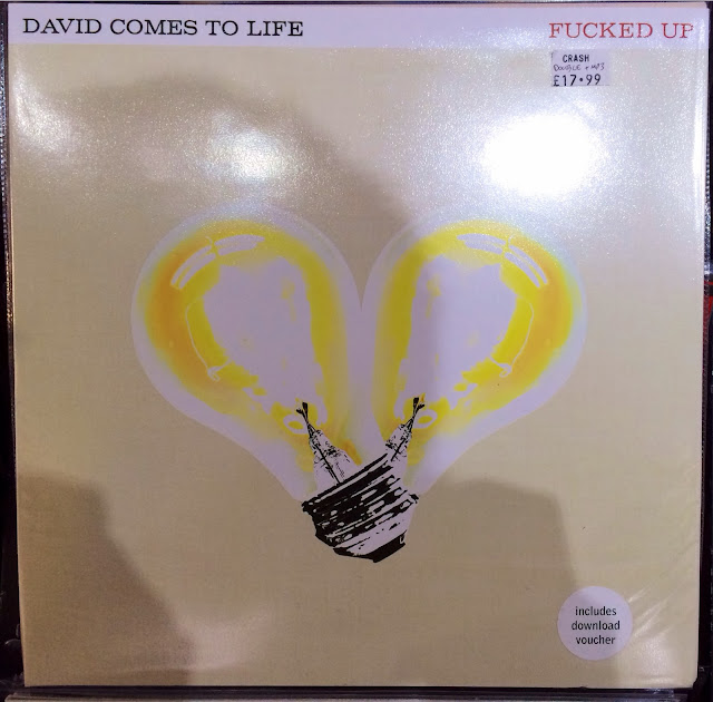
David Comes to Life - Fucked up.
This was one of my favorite sleeve designs, using contrasting tonal values within the color value yellow to create another image strong record sleeve. The images off the bulbs themselves look to have gone through some manipulation on photoshop, it looks like a posterize filter has been applied or the threshold levels been changed, although the connecting point looks to have more detail in there than the glass. This section may have been selected out, been grey-scaled and had a halftone edit applied. The graininess of this image works well with the serif typeface choice, if a sans serif typeface was used there would be too much of a contrast of clean and simple with the texture and grittiness of the imagery. The idea off centralizing an image seems to be common practice as presented here, within a square frame it just seems to work best giving freedom for were the type elements can be placed and still drawing sufficient attention to the image element. 

Chuck Ragan - Covering Ground. 
Finally an example which isn't relaying on imagery. This decorative use of old style wood blocked serif typeface and floral decorative borders creates a sense of imagery throughout the use of a lithography method of printing. There is a certain roughness and deterioration were the ink hasn't applied as thick and bold on the transfer giving off a feeling of visual wearing over time. I like the idea of using a border to frame in the central typographic element. If the typographic element in the centre had no border surrounding it, I think it would feel lost and due the printing style this clean use of minimalism wouldn't work. If it was a small point set sans serif typeface cleanly presented central to the design it would, but due to the decorative feel of the typography I feel the floral border strengthens the whole layout. 

Use of hand drawn lettering again keeps this decorative old style feel up. The use off an abstract drawing off an old vintage frame strengthens this old feel even more. The whole black and white scheme throughout is broken up by a small red element of the record label company found in the bottom left corner. This use off a small contrasting element presents the idea odd contrast off extension, using a small proportion of a high impact high contrast color brought the eye in even more too it.

A more abstract representation now using vector image making techniques and digitally produced letterforms to work with this techno/retro vibe. The idea of techno was presented through the use of vibrant neon hues with light and dark pink tonal hues and psychedelic vector line art using geometric shapes and linear elements to create an abstract image outcome. The use of angled lines to me present light beams often seen in clubs, an interesting abstract representation off a common club connotation. Using abstract imagery to present the artist and there album is something I want to look into. 

Slayer - God Hates us all.
Another example I really liked both front and back cover was this minimalist religious influenced slayer record. Using gold ink either foil blocked or screen printed on the record a nice effect is created. Using the common symbol used to represent Christianity an abstract logo is created to represent the album. The structure and composition of the album works well with the positioning of the typographic elements and the abstract symbol and all frames up nicely in a centre justified format. Gold is seen to be the color of generosity within religion, I feel the use of gold was influenced by the record title "god hates us all". A sly sarcastic dig at religion and its "generosity". I like how the sans serif typeface with its sharp point serifs contrasts well with the linear, angular abstract cross symbol. 

The type positioning here is slightly offset to the right, I think a multiple column grid allowed this minor offset. It works well though with the same serif typeface making an appearance on the back cover in left aligned format. Contrast is applied through type weights with the track-list been high in the hierarchy so this is bolder than the less important information displayed underneath. 

Fiction - The Big Other.
I chose this album more for the playfulness off the typeface choice on the track listing on the rear cover. But I do like the abstract digital photo montage used on the front.

The de-bossed foil block typography is very playful in its construction and positioning. Using vibrant dots to replace the title of the 'I's and the full stops after the track numbers kept the eye bouncing about the page a lot before arriving at the actual track list names. The colorful dots remind me of bouncy balls so this idea of moving the eye around like this fits in well with this thought. The typesetting is made up of a range of fonts from a sans serif type family, they appear in random uppercase, lowercase, lightweight, bold weights, regular weights and rotational positioning to strengthen this playfulness of the whole record design. It also keeps the eye moving about but when your trying to read the track name it is quite irritating, but the track names themselves are quite short and concise so its not too bad. 

To help me understand why theres such a big fascination within record cover design I began to look at iconic record designs and what makes or made them great both aesthetically and conceptually. I buy music from iTunes more than I buy records and CDs as I find it easier to manage so am not clued up on the benefits of owning an actual "physical" copy off the music. 

Here is an album created by Ian MacMillan for The Beatles, Abbey Road album and isn't based on aesthetics or design elements within type and image. Purely on the use of a strong image, the image presented is an iconic image showing true britishness through the band members individual styles, John in a white suit looking cool and fresh contrasting down too Paul walking bare foot in casual scruffy clothes. Through this album the crossing seen here was given grade II listing in 2010. This album is a classic example of how a simple iconic high impact image can speak 1000 words. 


Bellow is an album created by Mark Furrow for Spiritualized, Ladies and Gentlemen we are floating in space album. Although the aesthetics are very nice, I love the simplicity of the image and the linear elements used to frame up the typography used in conjunction with the very medical "clinical" blue which connotes this minimal design even better. The cover was made to look like prescription medicine and Mark pulled this of very well through his color choice, type choice and linear elements, the album played of the huge drug scene within the transcendental music era. The recommended dosage ="one tablet 70 minutes" to me is representing not just the CD playtime but the effects off a drugs consumption. Highly controversial and is what makes it so iconic. This is an obvious play on the music seen at that time presented through an interesting concept of interactivity and linking common connotations with the genre of music and the physical design of the record. 

A box set of the record was created to take this concept further, each track was placed on 3inch CD encased in a foil blister pack, more links to transcendental music and its drug links were used by including instructions saying "what is spiritualized used for?" Answer: Spiritualized is used to treat the heart & soul"

 I absolutely love this design for its aesthetic purposes, Joy Divisions, Unknown pleasures album was a collaboration from designers Peter Saville, Joy Division themselves and Christ Mathan. The decision to not include typography was decided when they felt the centerpiece should be a piece of abstract imagery, the image is meant to present a series off waves representing sound pulses. The suggestion came from Joy Divisions drummer Stephen Morris who was inspired by something he saw in the Cambridge Encyclopedia of Astronomy in 1977. An interesting combination of presenting sound in an abstract and visual way.
The final example here is Pink Floyd's, Dark Side of the Moon album created by Storm Thorgerson. The image here was out off Storms comfort zone, he was used to taking iconic photographs. But Pink Floyd's bassist suggested not to use photographs so the challenge was set. A photographer creating graphics. The image came from inspirations from one of Pink Floyds light shows and is a play on the common color experiment with a prism and is said to present the concept "thought & ambition" in a visual way. The idea is that thought is the white light that goes into the prism, ambition is the high aims that are to be achieved through the representation off the color spectrum. A very abstract visual response to an interesting concept. 

Monday 20 January 2014

Research Evaluation

Research Evaluation 

For this project I had the word Calendar given to me. I wasn't happy with this at first compared to other peoples words did didn't seem to have much scope so initially I was struggling how to turn this word into an interesting body of research based on the concept off 100 or the combination off; 20 images, 20 facts, 20 statistics, 20 opinions & 20 words. It needed to be engaging so how was I going to entertain myself and audience over something so bland?

The suggestions I put forward in the interim crit were off a lateral investigation into Calendar as its own umber all of things, like how calendars can be interactive. The only aspect that went forward after the crit was the element of Eras's, this element of Eras would form the base off my timeline off F1 from the 1950s to now. 

The interim crit made some good suggestions but the one I took forward was the Lunar calendar aspect, I had a back burner idea inspired by the suggestion of looking into things with moving parts. This linked with my initial thoughts off sports calendars and I linked this to F1 and its season, this was then linked with the Era's of 1950's to now and this is were it all sparked off. So i overcome a boring brief and turned it into something more interesting with a bit off out of the box thinking derived from crit feedback. 

From here I hit more problems, gathering imagery into Formula 1 was difficult if I was to collect it personally so imagery had to be collected from internet sources. Facts and statistics were easy enough to find, words I stemmed from common connotations and word association from peoples opinions. 

I enjoyed the brief once I got going finding out some interesting facts into the history of F1 and a new found interest into the engineering side. I loved the complexity off the construction of an F1 car and the fact that if under 1% off a F1 car is out of place then the car won't work whatsoever. This sense off accuracy is something I want to emulate in my design work. 

If i was to do this brief again I would have looked deeper into the engineering side and gathered more physical research, theres accurate model car kits you can buy and build your own engine kits that I could have played about with to provide myself with some interesting imagery. Presented in my research is the works off Fabian Oefner, I could have created something like he did only with an engine been deconstructed and blown up. 

Friday 17 January 2014

Personal Brief for OUGD405 Communicate

Personal Brief 

I have created myself a brief to give me direction on creating my digital smartphone app.

The app will be created for F1 fans, specifically the fans that have an interest in Formula 1 engineering. The purpose off the App is to inform and educate the user into the technical sides of F1 cars that they may not know about.  
They will access the app for an interactive experience into the technical details off a current leading car the Mercedes Mclaren MP4-28. If they download the App they clearly have an interest in engineering or little or no knowledge on it so they will want to see easy to digest information on the engineering aspects of a Formula 1 car in a simple easy to use App.

Type and image will help explain these aspects, use of image will be inspired by blueprint style drawings to show detail and technical parts of the car in a legible easy to understand manner. Type will work alongside this imagery in a simple, clear and concise application.

I will communicate this through an interactive onscreen App that can be downloaded onto most smartphones and tablets, the App will work as a point and click interactive system. Pointing and clicking on elements of an F1 car they want to find out about and expand upon into a separate visual image of the element with accompanying information.

The App as mentioned will be an interactive collection off informative drawings and bodies off text and will use technical language but still remain understandable through simple easy to digest snippets of information. Complex enough to inform them and keep them satisfied with what there digesting, but not too complex were they begin to get bored or confused. So the tone of voice needs to be very clear yet technical in its language. 

Wednesday 15 January 2014

Communication & Mass media Lecture

Communication & Mass media Lecture 

Has an insightful lecture today geared towards my practice of graphic design based on the communication of Mass media. The context is based on public communication to a large audience. The method in which it does so is through use of television, newspapers, magazines and radio.

There are subcategories off Broadcast media which consists of radio, film, music and television transmissions. 
Print based media which will be the main focus through physical examples of newspapers, books, magazines etc. 
Outdoor media is mass media in the format off billboards and signs seen on buildings, commercial buildings, shops, buses and sports stadiums as an example. 

My personal interests come under the subcategory of Graphic Designs through:
Typography
Adverts
Print medias
Social commentaries
Signage 
Packaging
Propoganda campaigns
Branding

"Introduction of the term ‘Graphic Design’:
1922, William Addison Dwiggins (successful designer):

‘In the matter of layout forget art at the start and use horse-sense. The printing- designer’s whole duty is to make a clear presentation of the message - to get the important statements forward and the minor parts placed so that they will not be overlooked. This calls for an exercise of common sense and a faculty for analysis rather than for art’." 

Graphic design was seen to be within the post modernism and modernism movements using the principles off form follows function to communicate a message. And national identity is portrayed through the style of that said designer based on his origins off living. 

The start off communication to an audience is said to originate from the painting of the Bison & Horses in 15000-10000BC. Although the audience would be limited to a settlement off people. 

Further communication to religious viewers was seen in churches in Italy presenting the story of jesus. There was no need for the use of type, even illiterate people could understand the message been communicated due to there familiarity off religion. 

The first form of advertising using fine art with additions of photography originated in 1886. 

Presented bellow are some off the most iconic designers to dates opinion on the term graphic design.


"Herbert Spencer: ‘Mechanized art’

Max Bill and Josef Muller-Brockman: ‘Visual Communication’

Richard Hollis: ‘Graphic Design is the business of making or choosing marks and arranging them on a surface to convey an idea’
Paul Rand: ‘... graphic design, in the end, deals with the spectator, and because it is the goal of the designer to be persuasive or at least informative, it follows that the designer’s problems are twofold: to anticipate the spectator’s reactions and to meet his own aesthetic needs’.

‘Whatever the information transmitted, it must, ethically and culturally, reflect its responsibility to society’.
Josef Muller-Brockman "

Through the writings off Steven Hellier common cultural acceptance off Graphic Design is attempted. 

‘Although graphic design as we know it originated in the late nineteenth century as a tool of advertising, any association today with marketing, advertising, or capitalism deeply undermines the graphic designer’s self-image. Graphic design history is an integral part of advertising history, yet in most accounts of graphic design’s origins advertising is virtually denied, or hidden behind more benign words such as “publicity” and “promotion”. This omission not only limits the discourse, but also misrepresents the facts. It is time for graphic design historians, and designers generally, to remove the elitist prejudices that have perpetuated a biased history’. 

Monet presents the birth off a modern society through his modernism movement paintings, he shows the presentation of a new working class going out enjoying there hard earned money on drinking them selves senseless because they have nothing better to do with there lives.

The birth of concept driven work derives from this cigarette advert that isn't your usual literal presentation of a product, its more off an abstract representation with vague links to cigarettes the viewer is made to look deeper into the composition. 

Format, type, layout and image began to be considered to communicate certain messages.

Peter Behrens work for german electrical company but Europe on the map for design, dominating concept driven and aesthetic relevant design throughout world war one and two paving way for abstract representations of concepts in design. 

Example of a propaganda poster playing on the traditional english class middle-class man. Very fine art based in its imagery. 

Compare this with the introduction to minimalist high impact european design that paved a way for national identity within design. The identity of Germany coming from the gothic use off type. 

Wassily Kandinsky inspired huge movements through the Bauhaus through his use off angular shapes and bold colors he inspired the likes off El Lissitzky to create high impact posters with these set house styles. This gave reason to believe that Graphic Design was the use of fine art imagery with the addition off type to communicate and explain the presented message that would not usually be understood by some cultures and people. 

Example off well informed and presented communication would be through the progression of the London Underground map that was first created by F.H. Stingemore and progressed onto the system that we see today and take for granted so much that is communicated to thousands off people everyday through the use off a highly legible and easy to understand system off maps and type design.

In 1922 a logo was created for the Bauhaus that solidified the categorization of graphic design as a means off communicating and opened up the subcategory of Branding as a form of communication through functionalist, and minimalist movements through type & image. The Bauhaus also created recognizable styles through the use of strong high impact sans serif typesetting, use of bold red colors and the horizontal angled positioning of type. They also proved that not all space needs to be used to create a nice composition, the use off negative space is important too to alter the balance and feel off the design. 


This same use of bold typesetting and angled bodies off type was synonymous with swiss style of design back in the 1930's. 

Decisions within composition were considered with the use of leading lines concept used in photography used in design to add depth and a feeling off distance in flat design pieces. 

Another example of the nationally accepted gothic type used by german designers. These were iconic pieces of design created when Hitler was in power. 

Propoganda posters proving that with a strong enough image type is not necessary this links back to the church painting back in the 1800's. 

Festivals began to spring up after the end of the war to celebrate the freedom off artistic movements that Hitler tried to put a stop too after shutting down the Bauhaus back when he was in power. 

Designers were becoming more culturally "Famous" through production off promotional materials for films. 

Iconic branding from legend Paul rand again showing simple use of type and the use of negative space communicates a strong enough message.

Ken Garland talks about our want/need for things through the pushing off products making us think that we need things that rant very important too us.

"We have been bombarded with publications devoted to this belief, applauding the work of those who have flogged their skill and imagination to sell such things as: cat food, stomach powders, detergent, hair restorer, striped toothpaste, aftershave lotion, beforeshave lotion, slimming diets, fattening diets, deodorants, fizzy water, cigarettes, roll-ons, pull-ons and slip-ons ...
Ken Garland, First Things First Manifesto, 1964" 

Ken Garland is a huge political figure using politics as a main driving point within his design with his strong use of the peace symbol back in the 1960's. He also paved a way for designers to use war as a method of creating emotional and high impact concepts within there designs be it tongue in cheek or down right disturbing and upsetting.  Both emulating a political dig on war in different ways. 

Communication began through the music industry with Peter Saville and Jamie Reid giving birth to a new style of design based on and inspired by the music scene arising in Manchester club nights. This style of design benefits from clean cut lines and simple clean layouts and became Factory Records house style from then on.


Neville Brody and David Carson played huge influence on the styles off design within the post modernism movement of Graphic Design. Both re-inventing huge magazine brands within there layout styles. With Carson's work appearing much more abstract in a sense that it communicates the actual subject through a more visual representation and he breathes life and energy into composition and use of image. A famous quote from him is that legibility should never be mistaken for communication "Don't mistake legibility for communication". I agree with this, just because a design looks nice and reads easy doesn't mean it communicates the given subject or concept. 


Skipping on a few years and the element of collectibles begins to arise, with people beginning to collect iconic designs off record labels from there hero designers Mick Farrow of Farrow design created the limited edition CD packaging for "Spiritualized, Ladies and Gentlemen we are floating in space". Through its unique packaging methods it was seen more of a collectable than an actual CD, with many people not opening the CD due to the value dropping once the seals are broken. 

The idea of politics and war is cropping back up again now with magazines using high impact images on there front covers to play with emotions. And a very unpopular rap group creating a mock up of the twin tower disaster before it even happened, sales of this went through the roof when the disaster happened. 

The final subject I want to look into is the element of consumerism. Barbara Kruger subconsciously critiqued and mocked shoppers over there shopping habits and need for sales through the use of branding to draw them in. The idea of the buyer thinking they need something when really they don't is something she played highly with through here concepts. 

This element of consumerism links with a more political side, with this poster mocking Nike and there production methods in a means to put people off there product. But designed in such a way in which it looks like a promotion although the tone of voice is completely different and very sincere. 

Final thoughts after this lecture are that I enjoyed the information I received i found it interesting how Graphic Designers and advertisers use so many subcategories of cultural events and outsource influences to help promote and pass on a message. It has made me think to look into lots of outsources to communicate a message in a less literal way and start thinking more outside the box producing abstract concepts that really make people stop and think. 

On the subject of Graphic design as a discipline I feel its birth derived from early communications has developed into the communication off capitalist interests with social issues becoming increasing promotion points ad campaigns and design worlds. 

Monday 13 January 2014

App navigation & Layout inspiration

App navigation & Layout inspiration

Bellow is a rough map on how the app would behave and navigate. 
The starting point would be the Image off the Mclaren Mercedes MP4-28, the way in which you navigate would be by clicking on the part off the car you want to find more about, a new page would then display a cropped and focused image off the element in question, a second click would add text to the image, a 3rd click would take you back too the main image off the car in most cases.

On the survival cell, engine. and wheels the user can go deeper into the deconstruction and explantations of the elements of the race car so corresponding clicks off the element would load another image and so on and so forth. 

To highlight elements that could be zoomed into and focused on for information expansion I will do something similar to the game Forza for the Xbox360. Display a little icon highlighting areas for interaction. 

To help inspire my layout I have included a selection of simple layout examples with basic use of type & image. I have also included a selection off illustration examples to inspire my image making element off the design process. The images off the F1 car will be illustrated by me, initial thoughts at this stage are to create drawings with simple lines to emulate a very mechanical feel that also simulates blueprint instructions. This is very fitting giving the app is for describing technical details and elements off the car. 

The app needs to be very easy to navigate with no distractions so I looked at a few blogs for inspiration as I feel there minimalism within the layouts is perfect inspiration for my app through there ease of use and focus on the designs/images they present and promote. Both these blogs, typetoken and newgrids follow a generic black and white scheme throughout with the navigation bars contrasting the vast white layouts with black boxes to highlight the selection. This use off black and white and  feelings off clarity and crispness is something I am going to use through my design process. I will probably use a sans serif typeface to maintain this crispness and with it been on screen I feel sans serif outweighs the legibility and readability off serifs due to the resolutions on varying phones been higher or lower than others things need to be kept crisp, clean and simple. 


This example of branding found on AisleOne.com by swedish designer Joakim Jannsson is a beautiful example of how centre aligned typesetting can work perfectly giving the right frame and type editing. This will be the starting point for the orientation on my app, or there about and will inspire my type layout, the spacing off the lines and the combination of tight and wide tracking creates interesting contrasts through a design that initially looks simple and minimal but has many fine little details in there once admired and examined. This is something I would like to do. Theres also an interesting combination off different fonts and uppercase and lowercase glyphs but I will maintain consistency and just stick to one typeface family. Again the black and white scheme displays clarity and crispness. I also love the vector logo, the combination off a circular element with very linear and angular type elements again creates a nice contrast and in terms of hierarchy draws your eye right into the logo which would have been the intention due to the logo been what the viewer remembers the most. The use of line art will be a main inspiration in the illustrations to keep with this blueprint influence within the composition   

Bellow is an example of Valentin Breynes branding off The Museum of European and Mediterranean Civilizations  and is how I plan on creating my imagery, it looks like a very accurate pencil drawing. Ignoring the type and layout on this design and focus on the image, this is were I want my main focus to be until the type is brought in through the interaction of the user. To recreate accuracy like this i plan on making pencil drawings and using fine liners and keeping everything greyscale but maybe experiment with one single element off color throughout the whole design on each page.