Showing posts with label Alphabet soup. Show all posts

Monday, 14 October 2013

Design Skills - Alphabet Soup - Typeface

Design Skills - Alphabet Soup - Typeface

Today we were briefed on studio brief 3. We are required to design a typeface for a fill alphabet and 6 glyphs of our choice. The typeface used as a base to build upon must represent the personality and character of my partner. Through a series of questions I discovered a basis on her personality and character, this will help me chose a font from the Adobe Font Folio for the start of my manipulations. 

Layout format will be a 4 x 8 grid on an A2 piece and a 45mm x 90mm name badge for my partner. 

Below is a list of my answers for my partner Helen Street, these will help me begin developing ideas for a base typeface and manipulation methods I could adopt.  

When is she happiest: When socialising with friends
Her greatest fear: Flying
Favourite place in the world: Rome
Earliest memory: Riding bike into a wall, then not a lot after. 
Her most embarrassing moment: Sitting in a strangers car thinking it was her families.
What makes her unhappy: Family disputes.
Who would play her in the film of her life: New girls Zoey Des channel 
Favourite smell: Antiseptic smell
Favourite word: Mish Mash
Dream job: Graphic Designer
Fancy dress costumer of choice: Jelly fish
Guilty pleasure: Taylor swift songs
How does she relax: Walking and personal chill out time
What in her past would she change: Nothing life's perfect  

After further conversation I found out a few more interesting facts like; 
She would like to play the guitar
Likes hand making things in a craft kind of way
Has an interest in car mechanics and how car engines work
Knows sign language
Doodles a lot when taking notes
Left handed
Appreciates intricate objects 
Clumsy
Organisation/Structure based person 
Favourite colour is green and she likes to wear black
Music wise she likes Indie bands like gaslight anthem
Sarcastic person and loves Korma.

Friday, 11 October 2013

Design Skills - Alphabet Soup Inspiration

Design Skills - Alphabet Soup Inspiration

Now i have basis of the concept i want to apply to my letterforms i am going to begin to look at some inspiration sources. This is an ongoing thing so there will be lots off images posted up from varying sources some been visual based like designers and some outsourced like architecture and mechanics to maintain a broad range of inspiration. 

ThreeSix font found on typetoken.net
Legopress by Levi Bunyam
Valee Duhamel
have chosen these 3 examples so far for there range of styles and processes used. My favorite been the lego press due to its unique production method creating his own letter press has made a nice final outcome that emulates a visual brail type style. I would like to look at other sources of making prints and mark making. The threesix font is nice in terms of its abstract style i like how retro it looks so to speak like the old space invaders typeface, very digital in its style yet clean and simple. The last source of inspiration is a sculpture that to me represents fracture. It looks like an explosion caught mid motion, i like this idea of motion been portrayed in a still object as I have tried out in my rough thumbnails and would like to progress again, use of color would be nice but to maintain legibility of letterforms i will just take inspiration from the shapes and the geometric layout of them.


Apeloig Drop

Above is a typeface I am really fond off stumbling across this agency I found there working practice/style within typography similar to mine. Although they seem more playful in the creation of some of there typefaces but they like to create an image out of letterforms but still create a crisp clean legible finish. This typeface is called 'drop' and definitely emulates the title it has avery fluid feel that represents water and liquids in a playful way that has a certain motion too it. 

Wednesday, 9 October 2013

Design Skills - Alphabet Soup

Studio Brief 1 - Alphabet Soup

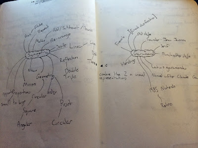
To begin the project in terms of context and research I begin my development process by doing a quick mind map on my 2 given words to gather a base of words to gain imagery and generate ideas from.


My favourite words that I feel could prove beneficial to creating ideas for visual solutions are:

Reflections
Geometry
Pivot
Angular
Linear
Proportion 
Repeat

From this Bank of words I will create a word association list to dig deeper into ideas for visual responses through personal responses to the word and research into word origin:

Reflections: Opposite, mirror, distort, ripple, water, illusion
Geometry: Accuracy, circular, measure, astronomy, combination of ancient greek word geo (earth) & metron (measurement), maths
Pivot: Point, rotation, twist, alignment, leverage
Angular: Right angle, 90 180 360 degrees, curve/arc
Linear: Circular (opposite to Linear), square, arrows, dimension, cubic, 2D and 3D
Proportion: Architecture, small to large, leading lines, prospective
Repeat: Re-arrange, layout, splice, cut, manipulate

When looking into the typeface Garamond I discovered a few key points that I found interesting, Claude Garamond was the publisher and designer of the typeface basing the styling of it off old punch-cutters. He was part of an influential movement of type design at the time been one of the leading type designers of that era. The old style serif typeface is seen to be one of the most legible typefaces used in print applications and was used on the 1985 Nintendo console in an italic form and in 1988 The Guardian newspaper redesigned its masthead of its paper to using 'The' in Garamond and 'Guardian' in bold helvetica. A nice contrast of sans serif and serif faces. Unique noticeable points are the small bowl within the 'a' and the small eye of the 'e'. 


en.wikipedia.org/wiki/Garamond
Jean Jannon had a part in the version of Garamond you see today altering the letters into more asymmetrical formats and after a raid by the French government on his office Cardinal Richeliu named the type Caractere de l'universite and it became the house style of the Royal Printing office in 1825. A massive fraudulent movement stealing and claiming ownership over something they had no involvement with creating a very controversial history behind it all.  


Typeface anatomy

We had a workshop on typeface anatomy while undergoing a typeface manipulation task using our new found skills within this segment of Graphic Design. Knowing typeface anatomy is important in many ways, it is a language in itself. When describing typefaces and letterforms it is necessary to use the correct terms instead of "the round bit and that bold bit" is far too informal and confusing. 

I have stored this diagram of anatomy here to provide a constant reminder of terms of the elements within letterforms. Terms labeled above don't really need much explaining as the picture presents a clear enough image on this aspect to me.

But important terms I have learnt to be important that are not shown here are the following (to be constantly updated):

Aperture is partially encloses negative space within characters like n, c, s, lower part of an e, upper part of a.