For out viral communication brief we needed to raise awareness and money for a charity through some creative method. After looking through various charities and charity types we decided to go with Skatepal.
The charities goal is to spread the love of skateboarding through Palestine and build skateparks where locals can come and learn how to skate.
40% of Palestinians are under 15, over 50% of youths struggle to find work. The outlook isn't good for youngsters there but this cultural, educational and sporting opportunity gives them chance to be involved in something productive for the community and allows them to express themselves in creative and constructive ways. Both boys and girls are welcome to the sport program.
Skateboarding is the vessel of the whole charity, the founder has skated for over 12 years and sees the sport as a way to build self confidence and self discipline swell as been a great form of exercise.
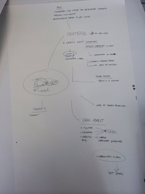
After a brief discussion and some disagreements on the past name "pole" we came up with a better name for our collaborative. Salt & Sauce. This name suits us better as it isn't such a serious name like "pole" seems quite stern and abrupt.
The name Salt & Sauce basically describes us through a abstract representation of how salt & sauce go well together but are too different things like sweet & savory. This describes out individual characters within personalities and design style, along with the collaboration of a charity with a group of designers. It also contextualizes the them members origins from different places within the UK and Europe, we spoke about home comforts and what brought us together. Food was a main conversation point that seemed to link us all together and reminded us of home a little more.
To begin with we began trying to form an action plan within our groups. We collated all our research on how things could be made viral and began on deciding on a charity to put these concept idea into action through.
Exploring health charities, children's charities and the events they run we decided on choosing the charity Skatepal. Skatepal are a movement that raise money for building skateparks in Palestine and teaching kids how to skate, this encourages activities and keeps kids fit. We felt choosing this charity links better with a younger target market/art & design market due to the popularity of skateboarding within the art and design community. The visuals we could produce for event will also be more visually interesting due to the more interesting starting point of skateboarding.
We then began to think of ideas how we could collect donations for the charity.
Action plan pitch.
The plan would be, we will be raising money for charity Skatepal. We plan on pitching a proposal for creating an exhibition or a stall. The stall or exhibition will give us opportunity to display design works to raise money for the charity.
Holding an exhibition or a stall gives us opportunity to create promotional materials in the form of print outcomes (Leaflets, booklets, logo etc) and social media outcomes. Creating a twitter & Facebook group gives us easy access to a huge audience through the groups combined friend lists.
The medias we plan on selling at the exhibition or stall will be prints and a limited number of T-shirts. Each member of the group will produce there own T-shirt design or a group T-shirt will be created displaying a visual collaboration of our groups company name and Skatepal the skateboard company. The prints on sale will be created from submissions entered by other creatives in the college based on our given theme.
We need to think of a company name so we pitched a few ideas forward within the group and decided on the name "Pole". We came to this conclusion after ruling out the following options.
Links (How we as a group link together with unique disciplines to create a collaboration of ideas)
Donuts (A more humours connotation of the above, the idea of a donut been a circular element simulating a continuous link)
NSEW (Has links to the groups hometowns been in an array of places, Scotland, Italy, north of England, south of England east of England)
Polar (Comes from the above idea of different areas, but a more abstract representation of it through the concept of north and south poles at the top and bottom of the world, this has good links with how were making a difference for a charity so far away as well)
Polo (The Italian of polar)
We arrived at "pole" by looking up the synonyms of "polar", the word pole had a more straight to the point wording and for a logo less characters created a better visual.
To do list.
Create a logo for "Pole"
Promotional material for the exhibition/stall
Create social media sites for Pole X Skatepal collaboration
Create a theme for the design submissions to be sold on the stall/exhibition
Create submission information/guidelines for the design submissions
Create a color scheme framework/requirement for design submissions
As my group will be creating content of a charity I felt like looking at what charities were out there would help us decide on who we could collect and raise money for through the outcome we produce.
One example of how this could tie together would be producing an exhibition of artworks that are then sold to collect money for the charity in this case cancer research. This gives us scope to throw an actual event which would need promotion materials making. These promotion materials could be both print and digital. Print invites, business cards, leaflets and signage etc. Digital promotions online like social media websites and blogs.
After looking on a charity website its clear theres lots of charities out there and due to it been a group exercise we all need to agree on what charity sector we will collect for.
Bellow are a few examples of lower budget campaigns for less known charities that have still managed to get a lot of recognition through playing with viewers emotions by shocking them, amusing them, been sarcastic and educating them. Tone of voice plays a huge part in portraying the correct emotion as well.
Raking up over 1.7 million views this clever video has drawn in the attention of both men and women worldwide.
Staring off as a typical night on the red light district we see 6 women in lit windows passing by and milling around. An unexpected twist takes place as one of the ladies starts to dance. By the end a crowd forms and a billboard flashes up highlighting links between sex work, trafficking and casual dancing.
Raking up over 1.7 million views this clever video has drawn in the attention of both men and women worldwide. The video is a way in which the viewer can be made aware of issues of human trafficking by creating an abstract representation of a typical night in the illegal sex trade world.
"The Gift of Water have created this viral video called ‘The First World Problems Anthem’ this simple yet powerful video points out that those everyday insignificant problems we face such as ‘I hate when my phone charger doesn’t reach my bed’ aren’t really problems at all. It shows us that we have nothing to complain about when people are facing real and life threatening issues; like not having access to water."
Having over 2million views this campaign sarcastically compares our everyday "problems" we take for granted and how the people in these countries struggle to even have the simple things in life. An emotional dig at our culture and our unnecessary needs for consumerism when theres much worse things going on out there.
Fragile Childhood shared a compelling message via their viral video ‘Monsters’. The anti-drinking campaign focuses on the real monsters that some children have in their lives - loved ones with alcohol issues. It shows children and their struggle to get through their day, whilst showing why and how they view their parents. It’s heartbreaking yet very affective. The video has gained over two million views so far.
Again by using children a more sinister tone of voice is portrayed, playing with the viewers emotions and educating them of what children see when there parents are drunk. A very unique way of presenting drunk parents instead of showing the aggression they are linked with common childhood fears of clowns and monsters etc.
A campaign called ‘Don’t Cover it Up’ created the video ‘How to look your best the morning after’, to help stop domestic abuse. The video mirrors a traditional YouTube tutorial, that many people make, but this time the make up artist is giving tips on how to hide injuries given by a your partner or loved one.
The popular Vlogger, Lauren Luke, uses her primarily female fan base, who enjoy her make up tip videos, to help raise awareness to help stop the violence.
A sarcastic twist on a traditional makeup tutorial video showing the problems of domestic abuse, the target been mainly woman through the creators female fan base she has already built up. Again playing with viewers emotions helps portray the message across here, informing them of a problem that woman are trying to hide behind a mask of makeup.
To help me understand how something becomes viral I will research into how past medias became a viral communication and analyzing what makes them successful.
To begin with though I need to point out the key differences between commercial viral medias and non commercial medias. What I mean by this is the difference between big advertising brands taking advantage of sending media out through there big budgets and production advantages they have over solo non commercial campaigns or medias.
A good comparison would be the shetland pony advert produced by mobile network three (commercial big budget advert). This advert was only aired in the UK but due to youtube accounts streaming the video and people spreading the advert through social media sites like Facebook and twitter it became a global virally communicated video. This highlights the importance of social media and how it aids communication too a wider audience, all it takes is a video to be shared on Facebook or liked on twitter and a friend see's it and re-tweets and re-shares it and it can spiral on from there. In this instance the reason why this video became viral was because of the comedy factor and the fact "socks" the pony was actually a real shetland pony.
The reason why this became so viral was in my opinion due to the abstractness of the concept, a dancing pony has no relevance too three so it wasn't really seen as an advertisement as such. It was seen as just a comedy youtube video, and I feel this comical tone is what aided its success. http://www.three.co.uk/Discover/Sharing_stuff/Dance_Pony_Dance_the_story_behind_the_commercial
Moving away from commercial media campaigns that went viral to non commercial "home movie" viral medias. The most popular example would be this video that again like the shetland pony ad has a comical value too it but not for promotion purposes. This video has over 660million hits on youtube and shows how something so simple can create such a viral communication without the use of big budgets, promotions and a big company name behind them. This is a try example of how successful viral media can really be.
One reason I think this was so successful is due to the fact of its "cuteness" the Evian water advert proved how using babes and children can be extremely beneficial for promotions and creating high impact advertising campaigns.
A controversial campaign backed by the "invisible children" charity demonstrated the power of social media exposure through its campaign to stop Joseph Kony a Ugandan warlord from carrying on kidnapping children to use for his army in Africa. The campaign video itself mentions the high volume of people who use social network sites and is basically calling out for the use of these social network sites to spread the word of this political issue. Although initial public response was strong I feel overall the campaign failed. And here is why.
It did just that with over 100million views in a week from the original release, the campaigns original plan was to promote the "cover the night" movement, were people purchased a pack of posters and stickers (All proceeds went to the charity to help the children's who were victims of Konys reign) and blanked there cites by illegally fly posting stop Kony posters around there cites. The reason the initial response was so successful in terms of video shares was the shock factor, of the video. It played on the viewers emotions through sinister tone of voice and upsetting scenes of children made people want to help out even more.
The intention of this movement was too "pressure governments into hunting down the guerrilla leader, who has waged a brutal, decades-long insurgency in central Africa.". Although even though they had such success with the digital media boom and sharing of the video there was a very poor turn out for the cover the night movement. This kind of showed his disposable and trend driving people can be with these viral medias, they never really took heed of the movement, they basically just liked and shared the video to be part of the huge movement of people making the video viral. They never really made effort to leave there house and take the movement forward, this is an example of an unsuccessful campaign that didn't go to plan so much.
I really do see social media and digital medias are the best way in which a campaign can be spread. Things used to be spread by word of mouth, by gossiping and conversation but this is more done through the digital age now. Social media is the way in which things is passed on through word of mouth, and the method in which it is delivered and shared is equally digital like the above examples of youtube videos been the primary method of communication.
Viral medias don't always have to communicate something though. Viral contents can come from a variety of medias, iPhone apps and games that are increasing in popularity now. They also link with social media and the sharing of content.
One example of this could be seen as the photo sharing app instagram. Starting off small and growing into something that is now owned by Facebook (hence social media merge) the app has elements inspired by the viral "hashtag" used to tag your photos so people can find photos under the categories they search and you can have a group of friends or "followers" on it.
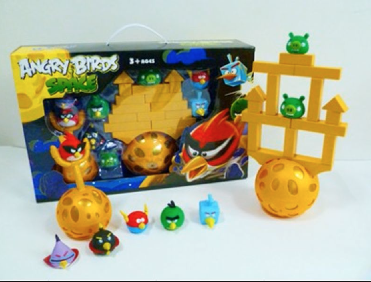
Viral media can be seen in games too, the game angry birds was a huge hit, a simply produced game that due to the viral popularity of it stemmed off into something a whole lot more. Merchandise was produced, This shows how something so simple can lead into something a great deal larger and diverse into different markets attracting yet more target markets that could send that content viral within that subcategory.
How can content be made viral?
From what I have researched I feel there are a few main aspects that need to be addressed to make content viral.
Concentrating on public trends would be a key thing.
Playing on the viewers emotions through the tone of voice of content. Be it positive or negative emotions by either informing them, promoting something, educating someone, entertaining them, explaining something or engaging with them through interactivity.
Make use of social media sites for promoting the campaign or movement we intend on creating.
Be unique and abstract, don't make a literal outcome for the content. Think out of the box like the shetland advert used to advertise a phone company.
After looking into how to make something go viral I found that the following need to be considered.
Trends, as mentioned trends are important. When people search on google, Facebook, twitter etc you have better chance of been viewed if the content you create is "trending".
Make a video, youtube and Vimeo are the most popular video sites with tie in links to Facebook if you produce something that people like it could be shared to thousands if not millions of people.
Pay attention to keywords and tags, if you want your content to be discovered through searching of social media and search engines make sure the texts included in the content or the tags are relevant and concise so they can be found easy within the search.
Try get noticed by a celebrity, although this is difficult a celebrity has a huge fan base. If you can get a share, retweet or a mention from a celebrity your exposed to an already existing fan base. Much like how big advertising firms continue to be successful, they already have there audience sector there for them.
Use humor, as mentioned playing with emotions is a good way to get people in on your concepts. People love to be made laugh, and as the pony advert and the charlie bit my finger video proves. Comedy works for viral communication.
Like the Kony campaign, be shocking and controversial. The content shared doesn't always have to be liked, bad publicity is still publicity intact it could even become more viral due to how shocking and hated it is . But obviously stay within certain rules as not to offend too much.
Be visual, you need to stand out. The attention span of the average web surfer or browsing audience is getting shorter and shorter, high impact, bold photographs, GIF,s anything that can catch the eye will prove effective at drawing people in.
We were put into our groups for creating a viral communication response. Our groups theme for the project was to create a viral resolution of some sort to do with a charity of some sort. Within our group we need to research the capabilities and opportunities of viral communication, including but not limited to methods of approached, medias, examples, campaigns etc.
To form the base of research I need to consider what Viral communication actually consists of?
Why is it successful?
Compare successful campaigns and unsuccessful campaigns and why I think they were unsuccessful.
What am I going to achieve, communicate within the resolution?
What do I want to say? how do I want to say it? What would the tone of voice and language be like?
Will I use type & image? Or one or the other?
What am I aiming to achieve? Am i communicating through a website, running an exhibition, producing print material, will it be an interactive element? These things need to be considered
The deliverables will be quite open but need to be limited to 2 colors and the paper stock used if the item is printed.
Viral campaigns rely on a message been passed on through the public, exploring social media, digital communication weather its communicated in a literal conscious concept or a subconscious resolution that has more hidden meanings playing on emotions of the viewer.
Initial thoughts at this time to begin informing our group are to go individually look ion charity campaigns, existing and past viral communications. Look into how something could be made viral, look into charities to do with sectors:
Medical
Childrens
Cancer
Homeless
Red nose day
3rd world countries
Also looking into celebrities and how they contribute to charities would be interesting, as there is a lot of social hype around celebrities using something that derives from them could provide relevance to creating ideas for a viral response.
The first idea we have though up very quick was for a charity even that Niels friend runs. Skatepalpalastien. A charity raising money to build skate parks in Palestine and teaching children a good form of exercise.
The idea we thought was to create a kind of exhibition displaying and selling artworks to raise money for the charity, this gives us the opportunity to be very broad with promotion materials in a digital/social network outcome as well as print media. So this concept has a lot of scope, the charity itself isn't decided though but the idea of creating some kind of exhibition for the chosen charity gives a lot of scope for the project.
Today we had a briefing on the practical side to context of practice. We finally have the chance to put all our theory knowledge into a design outcome, in this case in the form of a publication. A publication isn't directly linked with been a book, it can be anything ranging from physical print to a digital app to a website, so long as it has contextual information in it can be classed as a publication.
Whats important to consider is that the publication needs to be informed by the theory subject that is going to be included in the texts. And the texts included in our publication will have links with the content off our 3000 word essay. This will form the main research theme along side the original questions themes which had relevant too:
Sustainability
Consumerism
Modernism
Social Impacts
Propoganda
Visual Language
In my case the essay I did was on hip-hop music and the urban/street scene has
influenced fashion design and culture, along with graphic design. This touches on social impacts and visual language mainly and elements on consumerism. But the main umber all would be social impacts.
To inform my publication I plan on looking at existing physical and digital publications and I will decide what would be most relevant to my subjects concept. I will then go on to create ideas on how the publication will be created and put together inspired by my visual research.
As a whole the publication will be made up of 3 sectors these are shown bellow from the brief itself.
RESEARCH CONSIDERATIONS - You will need to review your existing research undertaken in response to the lectures, seminars and tasks from the first part of this module in order to identify specific areas of interest or points of focus. These could take the form of quotes, images, examples, critical responses, tasks, principles, ideas or concepts.
DEVELOPMENT CONSIDERATIONS - What do you want to say and how do you want to say it? How will you translate your research into content? What form or format will it take? Questions, answers, statements, quotes, images, photographs, drawings, diagrams etc. ? Can you combine these elements ? If so....How? How will you organise the content? How will you make it interesting?
RESOLUTION CONSIDERATIONS - What is a publication? How is it made? What format could it be? How is the format relevant to the content? Is this important? What are the conventions of publication? How do you work with these? What are the rules? Do you have to obey them?
All the above needs to be taken into account to create a well informed publication informed by my chosen subject of interest.
As I wasn't too keen on my illustration style I created for the digital mockups I chose to look into different styles of image making deriving from the illusive book and a past project of mine. As i wanted to emulate Jakes simplistic stripped back and minimal style within his music and fashion sense I gathered minimal style imagery.
The first example of imagery I found was Kate Suttons illustration, the technique she used was to hand draw the outlines and color in the imagery on photoshop. I like this idea as it has a combination off digital and analogue image techniques wich keeps things minimal and clean with a certain traditional aesthetic which simulates Jakes traditional influences within his music category "country music". I like the depth off this style of drawing, presenting three dimensional imagery through flat image compositions. This flat depth of field is created by simple color blocking and simple lines, no complex shading or complex shapes within the outlines. Simplicity.
Very minimal vector imagery, instead off adding detail I will try out the idea off creating simplistic outlines like the bellow. Very minimal and clean, I can concentrate on the use of colors to connote traditional influences and influences derived from song lyrics; Haunting, nightmare (Dream), cold. I like the contrasting 50/50 split of block color this could be used to present 2 different hues or tones representing both Jake Buggs style of music/fashion (Traditional/Simple/Heritage) and the relevance to the lyrics and feelings of the song lyrics mentioned previous.
Again to keep things traditional I looked back into my Foundation years work, I created a series of simple line and stipple fine liner drawings with watercolor coloring. Using pastel tertiary hues keeps things quite toned down wich has relevance to the albums feel, It was mentioned in the crit feedback how the bold bright colors didn't fit conceptually so dulling things down wouldn't be a bad thing like the bellow. I like the abstract depth presented in this image, there is a certain contrast flatness and depth within the composition through the simple line art, but also elements of depth through shading used with the watercolor coloring (due to characteristics and blending that is achieved with watercolors).
How to emulate traditionally.
Sparked by my visual research and quick thoughts into word association I came up with the following plan on how to emulate Jakes traditional style of music & fashion influences and simplistic stripped back style of music production.
Produce imagery with traditional influences through the use off analogue traditional drawing techniques.
Contrast this with digital manipulation to maintain a cleanliness and simplicity to simulate Jakes stripped back style.
Use minimal design compositions within layout, composition, illustration techniques and color application.
Use colors that emulate & connote traditionally:
Brown hues.
Neutral tones.
Orange tones have links with autumn and the country.
Use colors that connote the bellow lyrics:
Cold (Blue, White, Black, Grey)
Strange (Rainbow schemes, vibrant tones)
Nightmare (Black, Dark blues, Red)
Dream (Nightmare lyric flipped on its head) (White, Pink, Purple)
I began looking at alternative creative visuals used within the music industry. I wasn't limiting to just album artwork, anything relevant to music may inspire different visual ideas for my concepts I have thought up.
Bellow is a promotion video created by Vault49 a cross collaborative design agency who make the most off animation, design, illustration and photography within there creative responses for clients. In this case Ministry of sound. What I like about this is the grittiness and the business off the animation through the use of geometric shapes and the use of primary colors, the colors remind me off De Stijl movement I touched on in a past project. I like how the composition starts in the centre and the imagery works its way outwards and this is something I want to emulate in my design, I feel due to the square frame I am provided with a centre alignment of the main visual will work the best, making the most off the outer space will be experimented with and developed with to create sufficient balance within the design.
A production by the same agency bellow in the format of a standard CD album cover. I mentioned how I wanted to simulate a guitar string into a typographic form and this script influenced digital type gives me a brief insight on how I could play about with 3D effect imagery. Not really keen on the bright tones and the fluorescent scheme I prefer more tertiary pastel palettes. I may take forward the idea off illustrating a flat object like some string into something quite 3D by adding lines off lighter shades.
Studio Husbandmens artwork for the Popular Mechanics album. I like the use of imagery cropped inside triangular shapes and how the colors within these shapes contrast with the clean white background of the sleeve, all this works alongside the very bright and fluorescent Vinyl. Although the tonal range does contrast a lot between the sleeve and vinyl they do work well together. There are lots of different styles going on here, the morphed typography contrasting with the clean angular lines of the triangles create another interesting visual.
What I will take forward from this is the morphed glyphs and the abstract positioning of them. Could work well within my record artwork due to the album name "strange creatures" this style of lettering does have quite a strange abstract feel about it relevant to the abstract connotations of the lyrics and the singles name.
After looking at iconic album artworks I decided to look further into some of the designers of these artworks. Factory record designer Peter Saville & Storm Thorgerson both have distinct different styles.
Peter Saville
Born 9th October 1955.
English graphic designer.
Factory records.
Peters experimental approach is what inspires me the most, I don't really have a set style at the moment so I feel experimentation will help me narrow down to a style I can specialize in and use as my "house style".
Bellow are my favorite examples and shows how diverse album design can be to communicate the album, it doesn't have to be direct to the albums name. Like this design bellow, he was stuck on what to do for the album until a leaf got stuck in the windscreen and he decided on this as the focus point for the artwork. I like how the colours connote the season autumn. Very robust colours.
Here are the rest of the designs I am fond off based on the abstract use of color and the geometric shapes in the bellow. I like the abstract representation of a color wheel too it creates an interesting visual.
The illustrative feel with the contrasting clean serif typeface. This idea of one single color standing out on the stones will inspire my Harrington button design.
Illusive retro color scheme with psychedelic influences.
Love the interactive elements of the contrasting colors within the album and the simplicity and how typography isn't needed the design is strong enough without it.
To me this doesn't really look like an album artwork, it really reminds me of The Bauhaus style, the classic use of red and greyscale tones with minimalist elements and angular compositions of clean sans serif typefaces. The tag architecture on the bottom image is were I feel the inspiration for this album came from and if this is true this concept is presented very effectively.
Storm Thorgerson
18 February 1944 - 18 April 2013.
English Graphic designer.
Designer for Pink Floyd, Led Zeppelin, Black Sabbath, Scorpions, Peter Gabriel, Genesis, Europe, Catherine Wheel, Bruce Dickinson, Dream Theater, The Cranberries, The Mars Volta, Muse and Biffy Clyro.
Bellow are a few examples of his works, I love his abstract representations and how he uses everyday items within nature to create an interesting contrast within his compositions. The final one I love his manipulation of nature to create the human form in an abstract sense. He seems to have strange interaction with abstract elements and the human form.
Today we had an introduction into the two significant movements, Modernism & Modernity, Modernism was influenced directly down the timeline by Modernity.
Before modernity came about the world was governed by The church and the monarchy a very religious society. The term modernity and modernism follow different concepts.
Modernity been the presentations of the latest techniques, technologies and process's at that time period. Showing how up to date & contemporary the creative was.
Modernism was the birth off a movement within art, design, literature and the arts as a general umber all incorporating aspects off modernity within these said creative practices.
Its argued that the process off modernization allowed modernism to develop as a movement.
To put it into context the end off the church governed world and when the world became "modern" was during the power of St peters church and this sparked the power of creative minds.
Modernity really set in around the 1750s when the iron bridge showed the development and bragging rights off through the use of modern technologies and production techniques of that period.
1750-1789 saw the age of Enlightenment which sparked the basic birth of modern philosophy, research techniques and science. As shown in this experimentation on Anatomy presented by artist Rembrandt van Rijn.
And a painting of how science is represented by killing a bird showing its need for oxygen.
Bellow are the key dates within this modern period.
The key elements within this period were the following:
Rationalization - The reasoning on human existence.
Secularization - Evolution of the human race from the writings of Charles Darwin.
Democratization: No religious societ, not dominated by the Monarchy and the church. The separation of the rich and the poor faded with equal opportunities to everyone and the choice of vote became available for the majority.
The documentation off life and society began to be presented in a more modern way through the use of photography. The latter photo "the two ways of life" represents realism through modernity and shows the contrast of good (religious) and bad (sex, drugs and alcohol) with jesus in the middle. A multiple exposure photo showing the advancement of photography from the first photograph of the Boulevard du Temple.
More advanced techniques shown through Gustave Le Grays photo that has a fast enough exposure to capture the wave in motion almost.
Joseph Mallord William turner inspired the likes of Monet through his examples of realism and slight abstract elements were kept on the back burner for other future artists in the modernism & modernity period.
Monet presents the modern society off working class enjoying a drink after work in a realist fashion.
This presentation of the rich is contrasted by Gustave Caillebotte & Edvard Munchs paintings the first presents the upperclass in there wealthy society, Munchs painting represents in an abstract way the alienation of the rich societies.
Enter the 19th century. in 1907 Picassos Les Demoiselles made history by been classed as one of the top 100 paintings that changed the world and the real birth of abstract modernity artwork. It showed the human character in an abstract surreal way.
Modernity began to become very minimalist in its style sparked by Kandinsky's paintings.
All the above sparked the official birth of the modernism period. Mainly within architecture and the birth off minimalist aesthetics.
The movement was strengthened by the production of new materials like concrete, modern steel and reinforced glass which were presented in architecture in abundance. Mass production was the main body behind the movement creating cheaper more widely available products a lot quicker than before.
The term form vs function is best presented here when a typewriter replaces ornate hand wrote type, and in turn began the huge industry of type design. Typewriter representing function over form.
From here modern technologies were presented in the birth of flat pack housing inspired by its minimalist aesthetics and clean lines and presentation of the modern materials at that time.
My final relevance I took from the lecture was from how the above architecture gave birth to the iconic Bauhaus and the classic Bauhaus within the graphic design sector and product design sector. The use of angled elements and contrasting horizontal and vertical lines and simple use off color.