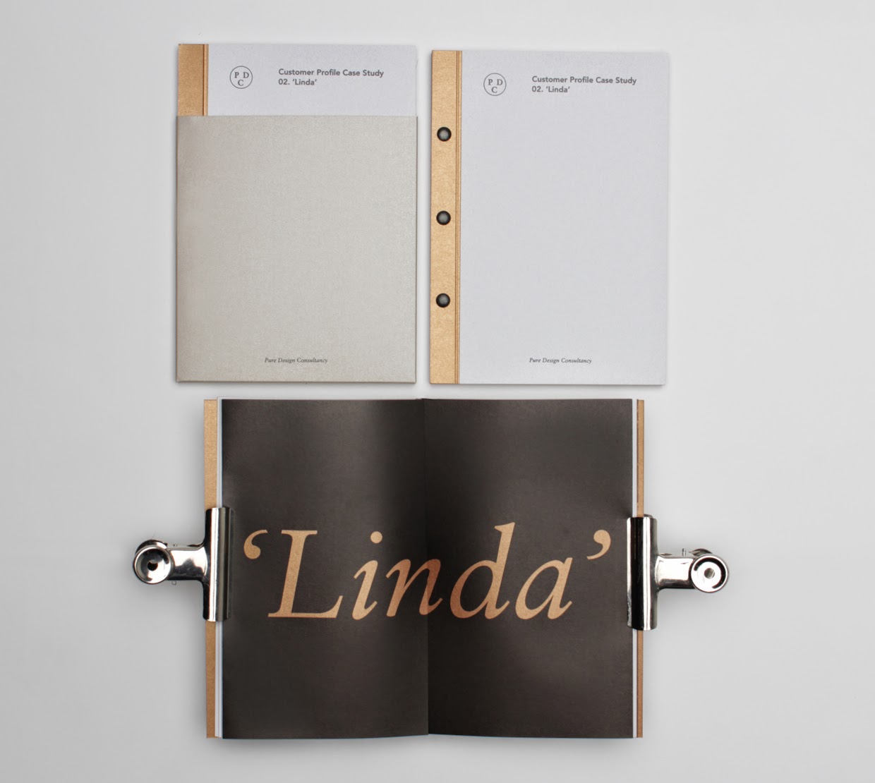
Creating content for publication
For the publication I needed some body copy and linking headers to go with the sections of body copy, the content didn't need to be very complex. Just rounding up the trainers technical details, my design influences, an introduction, a brief insight into the Brazil world cup, information on the hip-hop collaborator wyclef jean to solidify his involvement within the trainer design.
This content will work alongside the images of the trainer designs I create.
This content will work alongside the images of the trainer designs I create.
Research
The 2014 FIFA World Cup will be the 20th FIFA World Cup, an international men's football tournament that is scheduled to take place in Brazil from 12 June to 13 July 2014.[1] It will be the second time that Brazil has hosted the competition, the previous being in 1950. Brazil was elected unchallenged as host nation in 2007 after the international football federation,FIFA, decreed that the tournament would be staged in South America for the first time since 1978 in Argentina, and the fifth time overall.
The national teams of 31 countries advanced through qualification competitions that began in June 2011 to participate with the host nation Brazil in the final tournament. A total of 64 matches are to be played in twelve cities across Brazil in either new or redeveloped stadiums, with the tournament beginning with a group stage. For the first time at a World Cup Finals, the matches will use goal-line technology.[2]
With the host country, all world champion teams since the first World Cup in 1930 (Uruguay, Italy, Germany, England,Argentina, France and Spain) have qualified for this competition. Spain is the defending champion, having defeated theNetherlands 1–0 in the 2010 World Cup final to win its first World title. The previous four World Cups staged in South America were all won by South American teams.[http://en.wikipedia.org/wiki/2014_FIFA_World_Cup
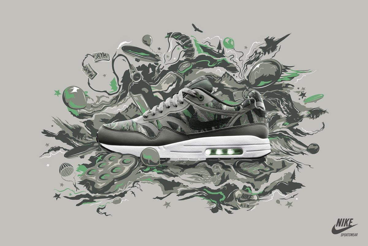
With styling inspired by the iconic mid-'80s ZX runner, these men's shoes combine a ZX 8000 outsole with a sleek woven upper, tonal laces and a moulded heel cage.
- High-quality woven textile upper with visible coarse texture
- Rubber toe bumper
- Comfortable textile lining
- TORSION® provides adaptive midfoot support
- Moulded heel cage
- Grippy ZX 8000 outsole
Multi-platinum, Grammy award winning artist, songwriter and producer,
Wyclef Jean has been an international icon since the mid 90’s when he debuted his talents as the frontman for the legendary Hip Hop group The Fugees. Followed by a hugely successful solo career and creating one of the biggest worldwide hits in pop history (Shakira’s “Hips Don’t Lie”), the music mogul is responsible for selling over 160 million records worldwide. After an attempt to run for President of his native republic of Haiti, Wyclef’s peers have given him the nickname “The General”-- a name which he now incorporates into some of his freestyle raps.
Winner of multiple Grammy awards and an American music award, the Golden Globe nominee has effortlessly crossed genres and geographic boundaries collaborating with such artists as Bono, Michael Jackson, Eric Clapton, Paul Simon, T.I., Mary J. Blige and Destiny’s Child.
His talent as a producer has led to a myriad of successful projects over the past two decades with major writing and producing credits on Carlos Santana’s album “Supernatural”, which won a Grammy for Album Of The Year, and Whitney Houston’s “My Love Is Your Love”… the list goes on and on.
Wyclef Jean recently launched his new imprint label, Refugee La Republique/All Handz On Deck. He also released a highly acclaimed mixtape “April Showers,” which is the most downloaded mixtape of 2013. The next Wyclef Jean album will be titled “The Carnival Returns” – sometime in early 2014; it will be a festive explosion of world music mixed with hip-hop and Caribbean rhythms. Music world get ready! It’s the return of the General!
Content I reworded from this body of research.
Introduction
To celebrate the start of
the 2014 World Cup in Brazil, the main sponsors of the event Adidas have teamed
up with Wyclef Jean a Hip-Hop artist who’s involved in the World Cup anthem Dar Um Jeito (We Will Find a way) to release a limited run of the
latest sports trainer the ZX Flux influenced by the World Cup in Brazil &
Wyclef Jean.
Brazil World Cup 2014
The 20th FIFA
World cup is to be held in Brazil this year, the event is scheduled to run from
the 12th of June to the 13th of July 2014. It’s the
second time Brazil has hosted the tournament, the last time been in 1950.
32 Teams have qualified
through to the competition with qualification games beginning in June 2011.
64 games of football are to
be played across twelve cities in Brazil in spectacular new or redeveloped
stadiums.
There will be the
introduction of goal line technology in the final stages to help decisions on
goals.
Spain are the defending
champions winning the 2010 World Cup final for the first time in there history,
in terms of history the previous four World Cup finals staged in South America
have all been one by South American teams so competition will be fierce this
year.
ZX Flux Jeito
The
trainer name “Jeito” came from the world cup track name Dar um Jeito, Jeito
translating to “way” in Brazilian, a suggestion of direction and movement which
has relevance with the trainers original design purpose & construction for
running sports. This is represented in the visuals of the trainer design
aesthetics (color, image etc). The song emits allot of energy within its beat
using drums and guitars and the lyrics so the color scheme emulates this
through a combination of bright hues and colors taking supporting influence
from the Brazilian flag, sandy beaches, the official world cup ball the Adids
Brazuc and the gold from the trophy
alongside the colors from the album cover of the anthem.
The
trainer is inspird by the iconic 1980s ZX runner, this modern remake combines a
ZX 8000 outsole with a woven fabric upper, lightweight fabric laces and a
molded heel support. This gives good support with a lightweight feel.
·
High-quality woven textile upper with visible coarse texture
·
Rubber toe bumper
·
Comfortable textile lining
·
TORSION® provides adaptive midfoot support
·
Moulded heel cage
·
Grippy ZX 8000 outsole
The
trainer itself has a silhouette construction with similar aesthetics to a
football boot, which has obvious relevance to the world cup.
Wyclef Jean
The
celebrity/hip hop name behind this trainer collaboration is multi platinum,
Grammy award winning artist, songwriter and producer Wyclef Jean.
He’s
been an iconic star since the mid 1980s when he appeared as the front man for
the famous Hip-Hop collaboration The Fugees and has managed to sell over 160
million records worldwide.
He
has been given the nickname “The General” from fans and peers, it’s a name
which he now imbeds into some of his music productions.
He
has collaborated with lots of genres of music and many artists such as Bono,
Michael Jackson, Eric Clapton, Paul Simon, T.I, Mary J. Blige, Avicii, Carlos
Santana and Destiny’s Child.
Wyclefs
Caribbean rhythm and uplifting music productions will be returning in 2014 with
international recognition coming from his involvement in the World Cup anthem Dar Um Jeito (We Will Find a way) ft. Avicii and Carlos Santana. This
recognition is going to help resurface his past success in the 1980s/90s and
bring him back up there into modern day Hip Hop music.