Publication inspiration
To inspire the visual development and production of my publication I will research examples of medium sized editorials. I haven't decided on an obvious shape for the format but I have decided on the size, I feel a medium/small size has a more comfortable handheld feel, not feeling too clumsy and large and not feeling to small and delicate.
It needs to feel quite limited edition as I mentioned, so looking at material/stock choice, experimental binding methods, use of color and interactive elements will be a a main source of my inspirations.


I like the use of the simple material used here, robust and thick stock used for the front cover gives a very solid feel too it, a very hand made and analogue aesthetic that contrasts with the digital imagery inside. The simple visuals on the front cover work well with this robust use of stock.
Found this on its nice that, a publication made by Australian designer Wade Jeffree.
I love the use of organic material with contrasting modern print techniques, this creates a nice quality aesthetic.
I like the binding technique, it has a raw sort of quality to it wich works with this contrast of a bold and simple print visual with organic/robust and simple material. I like the contrast of hue, the light pastel grey tone contrasts with a darkish tone red. This strong contrast is used throughout the pages.
I also like the sleeve that holds it in, gives an extra sort of finishing touch and an extra element of contrast through the contrast of bright white and grey/slate stock use on the cover.
 |
| http://www.itsnicethat.com/articles/wade-jeffree |
I like the use of the simple material used here, robust and thick stock used for the front cover gives a very solid feel too it, a very hand made and analogue aesthetic that contrasts with the digital imagery inside. The simple visuals on the front cover work well with this robust use of stock.

 |
| https://www.behance.net/gallery/Sole-Fresh-Sneakers/16091471 |
I like the minimal use of color on the front cover of this book, it contrasts well with the extreme use of bright tones within the double page spreads. I like this idea of high contrasting elements through use of color, or 1 high impact visual element with the rest of the components in the composition been very simple and clean.


 |
| https://www.behance.net/gallery/IDEA-WORK/6494255 |
Animal logo by Letterme Dowling.
This publication included 266 animal logos from the most famous designers and agencies around the world. I love the boldness of the publication, the use of bold colors with bright and vibrant tones means theres enough impact within the whole composition so they don't need to overcomplicate the typography and image. The images are very simple line drawings with extreme minimal Sans serif typography creating a main focus on the images through minimal type & bold colors and contrasting colors of black and white on the double page spreads.
This use of simplistic linear line art is one way in which I plan on illustrating my trainer design.

 |
| http://www.typetoken.net/publication/animal-logo-book-leterme-dowling-counter-print/ |
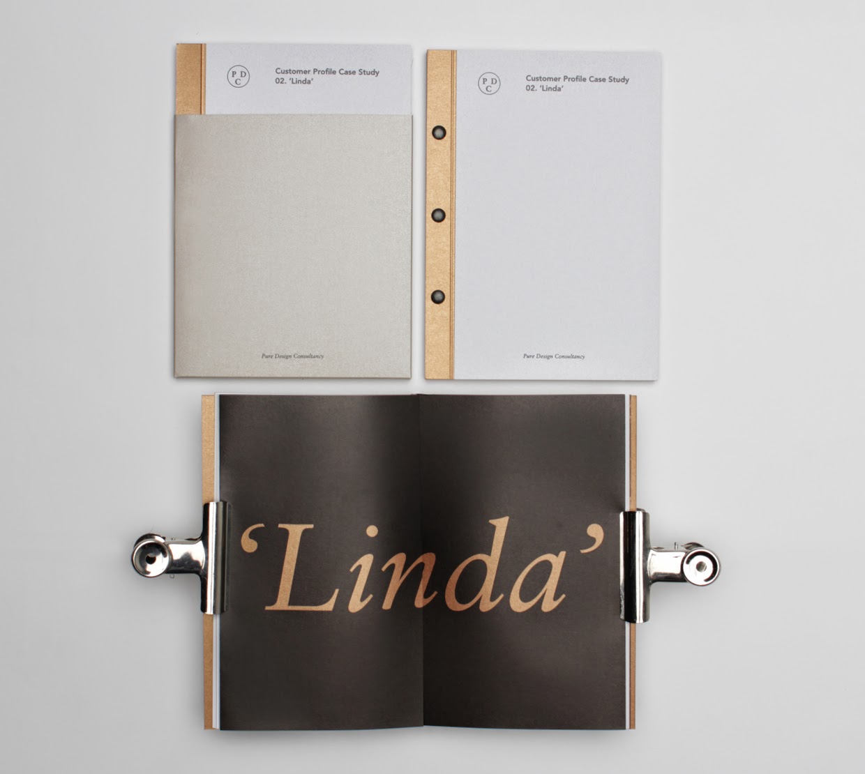
I chose this example for its unique binding technique, a sort of screw/bolt bind. And the unique printing methods used, I love the use of metallic, cooper ink, it has that mechanical and industrial feel that works perfect with the robust binding method. But all this contrasts with the ultra minimal design elements, so clean and simple. This is what I'm after. Something that creates a high impact, which then contrasts with something ultra simplistic and clean.
I want to also take forward the unique use of material and binding method, it will give the design solution a more limited edition feel.

 |
| https://www.behance.net/gallery/Pure-Design-Consultancy/15633351 |
Inspiration from past COP lectures, integration of past COP aspects.
Looking back over COP lectures and past tasks I have inspired some more initial thoughts that could go on into the ideas generation stage.
Looking through the lecture notes I took some inspiration from the movement of modernity & modernism.
Artists like Wassily Kandinsky have inspired me to use bold color tones, abstract shapes and very visually strong and busy layouts.

The clean lines, minimalist simplicity and architectural accuracy and simple use of material inspired by Le Corbuseir.

Angular, linear elements within design.

As my publication is going to be based around illustrative elements I looked back over my lecture notes on the illustration chronologies lecture.
Consider the different feel that can be portrayed through the use of drawing material. Bellow is an insert from the lecture notes explaining this.
"These concepts can be portrayed in different ways depending on the required message and the illustrators style and how he or she uses there mediums. The earliest examples of illustration been used as a visualization of communication was back when cave drawings were a visual language before typography. They worked due to our brains been programmed to respond to pictures in different ways. For example below are 2 examples of animals. One is Graphic Design, created for instructing directions. The other to communicate animal trafficking and to convey emotions and feelings through the powerful use of medias and composition within the aesthetics.


The use of ink has a delicacy too it it creates a sinister tone of voice through its monochrome color scheme and vague detail within the images. Creating a connotation of fading away and simulates how the population is dying off through the trafficking systems.
Other examples of tone of voice can be; playful, nostalgia and euphoric feelings all through use of color, style of drawing and composition.
 "
"
Trainer illustration inspiration
Bellow are some examples of how I would like to style the illustrations of the trainers using adobe illustrator as the method for digital manipulation. I may experiment with analogue techniques so I will include some examples of these in too.
Love how accurately these are drawn out, yet the solid colors with a flat depth of field too them with no shadow creates a very simplistic translation of the actual physical trainer. This would allow me to present the detail of the trainer design without actually having to mock up a digital "physical product".
 |
| https://www.behance.net/gallery/Need-More-Air-Max-1/14744965 |
Very mechanical feel, illustrating it like this would really emulate the technical factors of the trainer, like the construction of it and the support the trainer has on your ankles.
 |
| https://www.behance.net/gallery/A-Foot-in-a-Shoe/14751259 |
Love the faded effect you can get from watercolor, would create a more unique aesthetic as watercolor has very unique textures and shades rather than been all block color like vector work. Would have a more limited edition and unique feel too the aesthetics.  |
| https://www.behance.net/gallery/Rebus-2008-2010/635646 |
I found this on its nice that, illustrator Alex Walker has a very unique way of illustrating images, It sort of incorporates digital and analogue style imagery, the outlines are very crisp clean and accurate while the use of stipple style shading has a certain analogue aesthetic. I like the physical and aesthetic quality of this and will try a digital and traditional technique of illustration.
 |
| http://www.itsnicethat.com/articles/alex-walker-1 |
 |
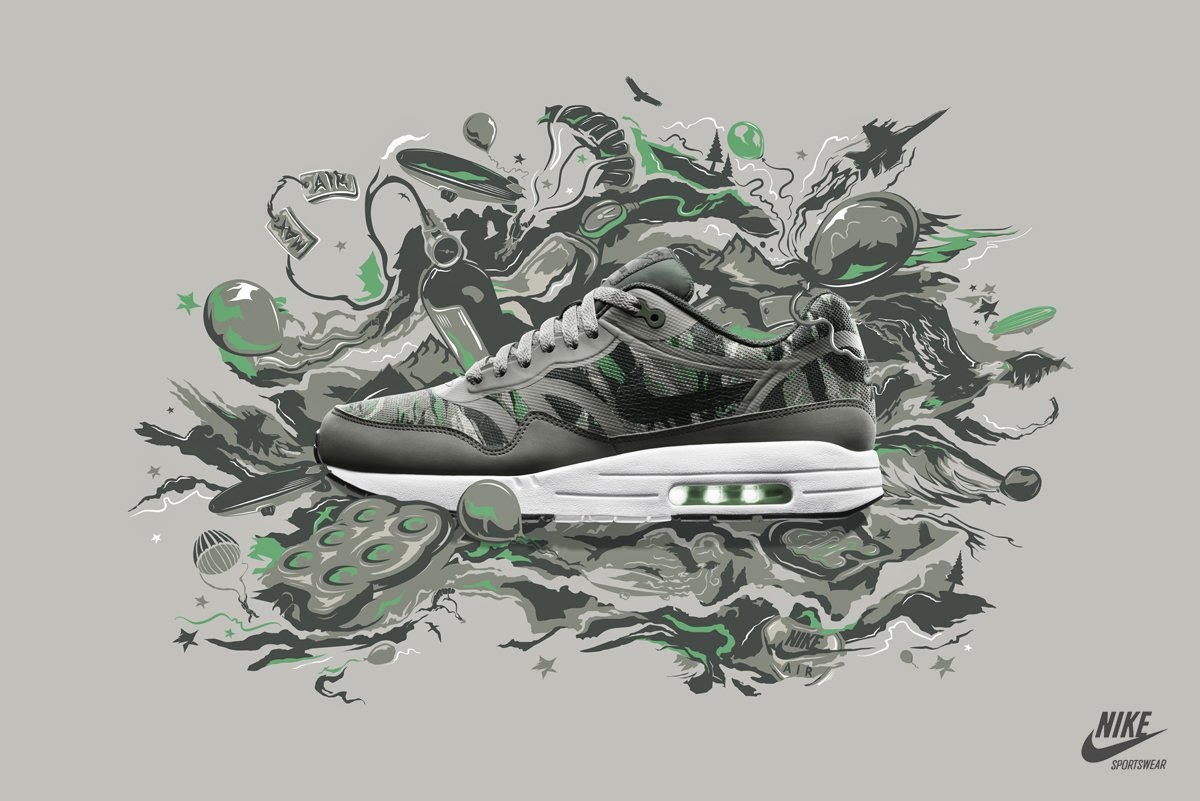
| http://ilovedust.com/work/nike-sportswear |
All the above aspects will go on to influence my design ideas and development.
No comments:
Post a Comment