Visual research for speaking from experience
After looking through an old book I had lying around called "contemporary graphic design" I found a few examples within it.
All the examples are type only in this selection of research as I don't feel the need to present any illustrations as the content doesn't really need any support imagery as its just going to be a basic calendar system with the addition to a guide on how to break down a brief which again requires no illustration.
I chose this design as I recognized it had a very unique style too it when looking through the book, I believe its a french designer and I feel every country has a certain style and this may represent there country style.
The simple 3 color scheme has a certain complexity too it through the use of this checkered sort of grid board visual, not knowing a lot about the design I can't really explain the concept here. But what I do like is how the traditional hierarchy is out of the window here. It appears the sub header of date information is in a smaller point size and is barley recongisible. The main focus is on the header that is spaced out along the squares in a way which causes slight confusion but brought me in due to this confusion. The individual glyphs can be appreciated more when highlighted in these squares.

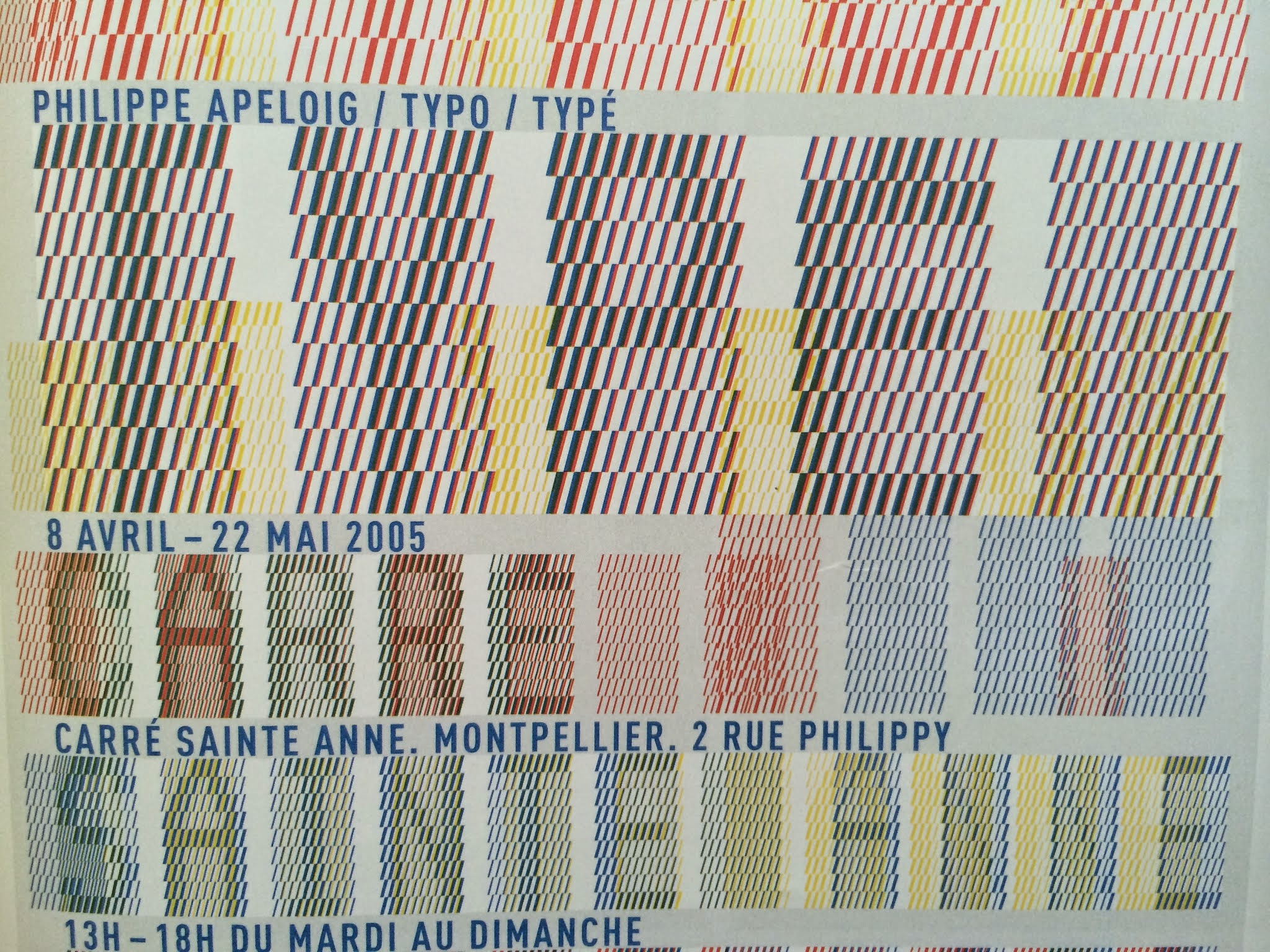
This example is a poster from the agency Apeloig. I follow a lot of there work recently and love there abstract approach to type design, they don't follow no set rules when creating a typeface. A typefaces function is to be legible and readable and each glyph is usually consistent in style to the other.
Apeloig don't really replicated this though, it has a certain consistency too it but due to the pixel style aesthetic of each glyph they have a very individual nature. Combine this weigh the bold use of vibrant contrasting color this is a great example of how type design like this really can be presented as a work of art.
This example got me thinking about using more physical design methods to create an alternative aesthetic to boring digital print. Using things like UV ink, glow in the dark in, embossing and even sewing as shown here will add a nice individual aesthetic too the designs. They will feel more of a one off and if I used these methods the students who receive them will feel like keeping them a little more due to there individual style.
I have included a few physical examples from the latest exhibition run by manchester designer Dave Sedgwick. The exhibition brought together Manchester studios and Barcelona design and illustration studios in a collaborative style. This was just a few examples of the print material from there and an invite I received.
This sign outside the exhibition made me think about abstract stocks and how I could print onto them, I mentioned a wall chart for my idea of the interactive calendar, what sort of materials and print methods onto these materials could i experiment with? Screen print onto cork board? Vinyl sticker onto white boards? An interesting idea.

I like how the simplistic layout and simple use of type is contrasted here with the 3D outlined typography. The use of stock is nice too it compliments the contrasting yellow shade nicely.
Taking influence from this 3D style typography I may go forward with creating a header or some sort of short few word quote in this style to add that element of imagery to a type only piece of design.
Taking influence from this 3D style typography I may go forward with creating a header or some sort of short few word quote in this style to add that element of imagery to a type only piece of design.

The two tone split in this flyer draws attention into a simplistic composition. The header "buy me by them" combined with this color block work together to create a high impact. The decision on putting the body copy on the orange side creates a more subtle factor in terms of drawing the eye in, due to to smaller contrast between the black type and the orange it doesn't pop out as much. If it was on the white side it would pop out more. I like how the design makes use of the color block to play around with how the eye is attracted to certain elements of the design, It really helps zone in on the advertising point of "buy me by them" I like the ornate style of the end of the stems how theres a sort of aggressive almost mediaval splice or flick at the end of the "u" , "m" and the "y" with a 45 degree splice trimming off the 't'. This ornate serif typeface contrasts with the clean cut serif typeface used in the logo.

The invitation I received with type created by Laura Meseguer. I like the physical quality of the letter pressing with color inside the deboss, although it hinders readability I feel the touch and feel of it brings viewers in to touch and feel and appreciate the quality finish on the GF smith blue and orange paper stock which really took the letter pressing on well.

The custom made fonts Laura made contrast much better on this orange background and receive the same attention to detail within the letter pressing process.

These examples were mainly selected for there extreme minimalism I feel like been very minimal in terms of aesthetics will provide the best method to communicate and present my content. Making use of lots of negative space will give the viewers eye room to breath and this will aid digesting the information in a quick and concise manner. Quick and concise is obviously a good thing due to the design solution been based on time management, so its especially important for time not to be wasted digesting pointless visuals in and been confused by abstract layouts and grid systems.

Extreme minimalism here from this design by pentagram ground on the tundra blog. Theres not a lot to say about the visuals, very conceptual to the name "jigsaw" definitely represents this. My design I plan on creating doesn't really have much substance to be cleverly conceptual on. The only thing I can be conceptual with is the use of color to promote productive and create design solutions that represent "time management" somehow.
I like how the documents use contrasting colors, the envelope is a sort of reversed out version of the letterheads and this envelope is a contrast in itself with the letter itself which is clever. I like how the spot varnish finish on the business card front contrasts with the consistent color contrasting found through the other documents.

This example wasn't really chosen for aesthetics, it did follow the very minimal use of type which I liked but I feel this example left too much white space on show causing a huge imbalance. I suppose the light brown tones of the paper helped draw less attention to this strong amount of white space but still It could include a few more elements within. I chose this for the use of a CD within this branding pack, I like the idea of combining digital and print based media in this sort of way. The CD design been considered gives something that contains digital media that physical quality that print media seems to have. If i went forward and created a CD I would definitely consider the design very carefully along with the CDs physical container.

Found on aisleone forma & co type only publication really shows how creative use of color and typographic choices can create very aesthetically pleasing pieces of design. The use of contrasting colors in a very minimal composition. The consistent system the symbols seem to follow with there abstract positioning is a strange aesthetic but is supported by the equally consistent alignment of the left aligned body copy and headers. This use of large symbols positioned around the composition make use of the negative space and make the page feel fuller but not overcrowded due to the simplicity of these elements. There is also a consistent 2 module space positioned throughout the 3 covers. (Top right on the 1st cover, 2nd row to the left on the 2nd cover, and 3rd row to the right on the 3rd cover. This makes the individual documents feel more as "one".

I like how the contrasting colors create a sort of clash here. But the problem here is readability, me doing this would distract attention away from important information and cause confusion in my interactive calendar system I plan on creating so although visually appealing it wouldn't work.

I found this on aisle one from London design agency Socio.
I like the use of stock here breaking up the extreme minimalism used throughout the branding. If this was to be printed on plain stock and simple black typography I feel it would look rather boring and tiring but the use of pastel hues in there colorful tones create a certain vibrance to a very simplistic piece of design. The type choice is simple, A clean cut sans serif in left and right alignments flush up to visual markers or spines were the column grids maybe positioned? A nice touch if so.

I will be taking forward into my design process stages and experiments; the use of paper stock to emit color, pastel shades, vibrant hues, very simple use of typography, clinicaly clean layout and use of grid along with more experimental layouts to give a more visual aesthetic to the design.
The experimentation of 3D typography for headers, framing things up with color blocks, linear elements or unusual typographic glyphs.
Physical design treatments like sewing, embossing, screenprinting and such print methods.
Combine print and digital, e.g. CD into a nicely designed holder with a nice design on the CD. The CD holder itself could include a piece of design like the guide on how to break down and work a brief.
No comments:
Post a Comment