Studio Brief 1 - Alphabet Soup
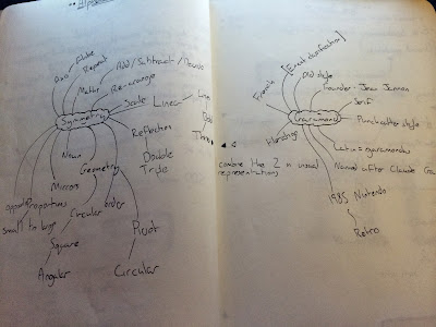
To begin the project in terms of context and research I begin my development process by doing a quick mind map on my 2 given words to gather a base of words to gain imagery and generate ideas from.
My favourite words that I feel could prove beneficial to creating ideas for visual solutions are:
Reflections
Geometry
Pivot
Angular
Linear
Proportion
Repeat
From this Bank of words I will create a word association list to dig deeper into ideas for visual responses through personal responses to the word and research into word origin:
Reflections: Opposite, mirror, distort, ripple, water, illusion
Geometry: Accuracy, circular, measure, astronomy, combination of ancient greek word geo (earth) & metron (measurement), maths
Pivot: Point, rotation, twist, alignment, leverage
Angular: Right angle, 90 180 360 degrees, curve/arc
Linear: Circular (opposite to Linear), square, arrows, dimension, cubic, 2D and 3D
Proportion: Architecture, small to large, leading lines, prospective
Repeat: Re-arrange, layout, splice, cut, manipulate
When looking into the typeface Garamond I discovered a few key points that I found interesting, Claude Garamond was the publisher and designer of the typeface basing the styling of it off old punch-cutters. He was part of an influential movement of type design at the time been one of the leading type designers of that era. The old style serif typeface is seen to be one of the most legible typefaces used in print applications and was used on the 1985 Nintendo console in an italic form and in 1988 The Guardian newspaper redesigned its masthead of its paper to using 'The' in Garamond and 'Guardian' in bold helvetica. A nice contrast of sans serif and serif faces. Unique noticeable points are the small bowl within the 'a' and the small eye of the 'e'.
 |
| en.wikipedia.org/wiki/Garamond |
Typeface anatomy
We had a workshop on typeface anatomy while undergoing a typeface manipulation task using our new found skills within this segment of Graphic Design. Knowing typeface anatomy is important in many ways, it is a language in itself. When describing typefaces and letterforms it is necessary to use the correct terms instead of "the round bit and that bold bit" is far too informal and confusing.
I have stored this diagram of anatomy here to provide a constant reminder of terms of the elements within letterforms. Terms labeled above don't really need much explaining as the picture presents a clear enough image on this aspect to me.
But important terms I have learnt to be important that are not shown here are the following (to be constantly updated):
Aperture is partially encloses negative space within characters like n, c, s, lower part of an e, upper part of a.


No comments:
Post a Comment